Achieving period-correct graphics in personal computer emulators — Part 1: The Amiga
UPDATE 2023-02-19: Add section explaining analog RGB, further elaborate my views on low-resolution “pixel art”, plus wording improvements and grammar fixes.
UPDATE 2022-11-20: Shader pack updated to v2, changed the instructions and screenshots accordingly, plus revised the whole article here and there a bit. Note that the names of the shader files have changed.
This is a significant update that incorporates Guest’s recent shader improvements, achieves better preservation of highlights, more contrast, sharpness & vividness, and subtler glow and halation. Enjoy! 😎
Table of contents
Preamble
In this article series we’ll be looking at emulating the Commodore Amiga, Commodore 64, and MS-DOS/early Windows era IBM PC compatibles with period-correct graphics (and maybe a few other classic machines, who knows?). What do I mean by “period-correctness”? It’s quite simple—the emulated graphics should look as close as possible to the output of CRT displays used with these computers back in the 80s and 90s. Now, there’s quite a bit of variance about the most typically used CRT technology per platform, and these differences matter a lot, as will be demonstrated. The below dream retro-setup showcases the perfect pairings for the aforementioned computers (no, it’s not mine, unfortunately):
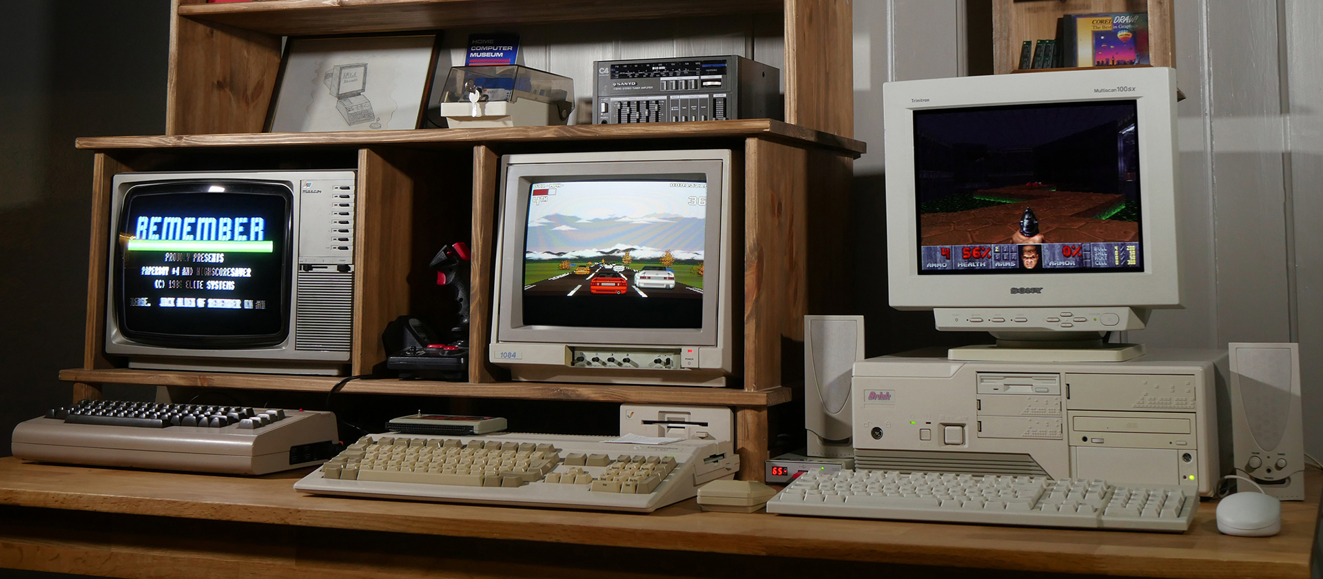
Of course, a small percentage of users who used their computers professionally may have enjoyed bigger and higher quality displays even back then, but here we’re going to be focusing on the experience of the typical home computer enthusiast (e.g. a kid, not a professional) playing games and watching a few demos now and then.
In case you’re wondering, my “credentials” are having owned these wonderful systems throughout the late 80s and 90s, and caring deeply about them. I used to spend far too many hours doing pixel graphics in Deluxe Paint on my trusty Amiga 500, got my feet wet with 3D with Imagine, and produced countless modules (songs) in ProTracker and FastTracker II, so maybe I’m a bit more attuned to the accurate emulation of the audiovisual idiosyncrasies of these classic machines than the average user (or perhaps not—many people who “just play games” can be very sensitive to these aspects as well). I’ve also done a fair bit of VGA programming in assembly on my first 486 PC, so I’m not a complete stranger to the low-level details of graphics programming either.
In any case, this is not about prescribing the “best” way of emulating these computers to anybody. “Best” is highly subjective; you can do whatever, for all I care, and it’s not that some friendly agents from the Bureau of Historically Accurate Retro-Computing™ will show up at your doorstep either if you’re not following this guide to the letter… However, if you’re after experiencing these systems just like people did back in the day (to the extent current emulation and display technology allows it)—whether as a die-hard fan of these iconic machines, or as a newcomer who is interested in learning more about the glory-days of home computing—I would like to think you’re in the right place. In any case, I do hope you’ll find this series a worthwhile and interesting read.
Finally, while I’ve been trying to do my best at presenting technically and historically accurate information in my writings, the more I researched the topic, the more I realised how much depth and subtlety there is to it. It’s not unlikely that I made a few mistakes here and there, and as there is far too much misinformation circulating about emulating these systems on the Internet already, if you’ve spotted any errors, factual or otherwise, I’d appreciate if you’d let me know in the comments so I can make the necessary corrections.
But enough of this lengthy introduction, let’s get to one of the best personal computers of all human history1—the mighty Commodore Amiga!
The Amiga
In the Amiga’s heyday, from the mid-80s to early 90s, pretty much everybody who could afford it used their beloved machine with the iconic Commodore 1084S monitor or a Philips CM 8833 (most 1084 models were manufactured by Philips and thus used the same picture tube; they’re essentially identical monitors). Sure, there were other Commodore models, the 1084 itself had dozens of variations over the years (and so had the Philips), but they all shared the same essential characteristics:
- 14" picture tube with a 13" diagonal viewable area
- slotted-triplet shadow mask (also known as slot mask, or in-line shadow mask)
- 0.42 mm dot pitch
- 15,626 Hz line frequency (horizontal scan rate)
- 50/60 Hz image frequency (vertical scan rate, or refresh rate; most models could handle both PAL and NTSC—or RGB 50 and RGB 60, to be more exact)
- 600-line vertical resolution
- composite and analog RGB inputs
Practically, they were really high-quality (for the time) and affordable small TVs with analog RGB inputs. As pairing the computer with one of these monitors is arguably the most authentic classic Amiga experience2, we’ll be looking at emulating this particular display in WinUAE, the premier Amiga emulator. Naturally, we won’t care about composite emulation at all—everybody who owned such a monitor used the much superior RGB input!
(Click on the image for an enlarged version to appreciate the details)
Analog RGB vs TV standards
Although it’s customary to talk about PAL and NTSC screen modes on the Amiga, those are analog TV broadcast standards and we’re dealing with analog RGB here. There are certainly differences between colours, gamma, and various image artifacts between PAL and NTSC on composite and coaxial RF (aerial) connections, but not on analog RGB. The only difference between them when connecting the machine to the analog RGB input of a monitor or a SCART-equipped TV is the vertical refresh rate.
Therefore, the proper names for these “PAL over RGB” and “NTSC over RGB” modes are RGB 50 and RGB 60, respectively. But I’ll just keep using “PAL” and “NTSC” in this article because they’re so entrenched in the popular vernacular, and that’s how these screen modes are named in every Amiga program and the operating system itself.
Single vs double-scan
A significant number of people really dislike the idea of using any kind of CRT emulation shader, and prefer the look of sharp rectangular pixels when playing old games on modern flat displays. Well, I used to be one of them so I know, and if we’re talking about emulating 320×200 to 640×480 (S)VGA games, I wouldn’t vehemently disagree (especially on 1080p displays). Even the cheapest VGA monitors used to be tack sharp, and they exhibited none of the various effects typically associated with CRT shaders (prominent scanlines, halation, bloom, etc.)
Moreover, 320×200 VGA was double-scanned at a line frequency of 31 kHz (you can clearly see that on the blown up image below; that’s effectively a 320×400 image) so you could not really notice scanlines on 15" or even 17" displays from a normal viewing distance, neither the effects of the shadow mask because of the very fine, typically 0.25-0.28 mm dot pitch. Emulating the shadow mask would require 8k resolution, and unless you have a 4k display, you’ll have a hard time trying to emulate the subtle scanline effect as well, so in general it’s best and easiest to stick to sharp bilinear or integer scaling for DOS and early Windows games.
The situation on the Amiga, however, is entirely different. As mentioned, Commodore monitors were essentially small TVs, subject to SD TV standards. PAL (NTSC) programmes display 50 (60) half-frames (fields) per second, interlaced, at 576 (480) lines of vertical resolution. What this means is that the display alternates between even and odd fields at 50 (60) Hz, and every field only contains 288 (240) lines, stretched to fill the screen (there is literally a 1-line vertical offset between the two alternating fields; this is the cause of the infamous “interlace flicker”). Interlace is not that great with mostly static computer generated images having sharp contours, so for low-res they used the same trick as most consoles of the era: they simply just sent the display either all-even or all-odd fields, rather than alternating between even and odd. The result is a completely static 50 (60) FPS image, but the scanlines now only have half the “density” vertically, so to speak, which is the main contributing factor for the famous “scanline” look. Scanlines are much more noticeable on NTSC because of its ~17% reduced vertical resolution compared to PAL; this causes the lines making up the image to be placed further apart (incidentally, this explains why certain forms scanline-fetishism seem to be more rampant in American retro-gaming circles nowadays…)
The below photos of Commodore monitors displaying 320×200 low-res in NTSC illustrate single-scanning very well (enlarge them to inspect the details).
And this is a video recording of an NTSC Commodore monitor in action from AmigaLove (you should watch it in fullscreen at 1080p to appreciate the details).
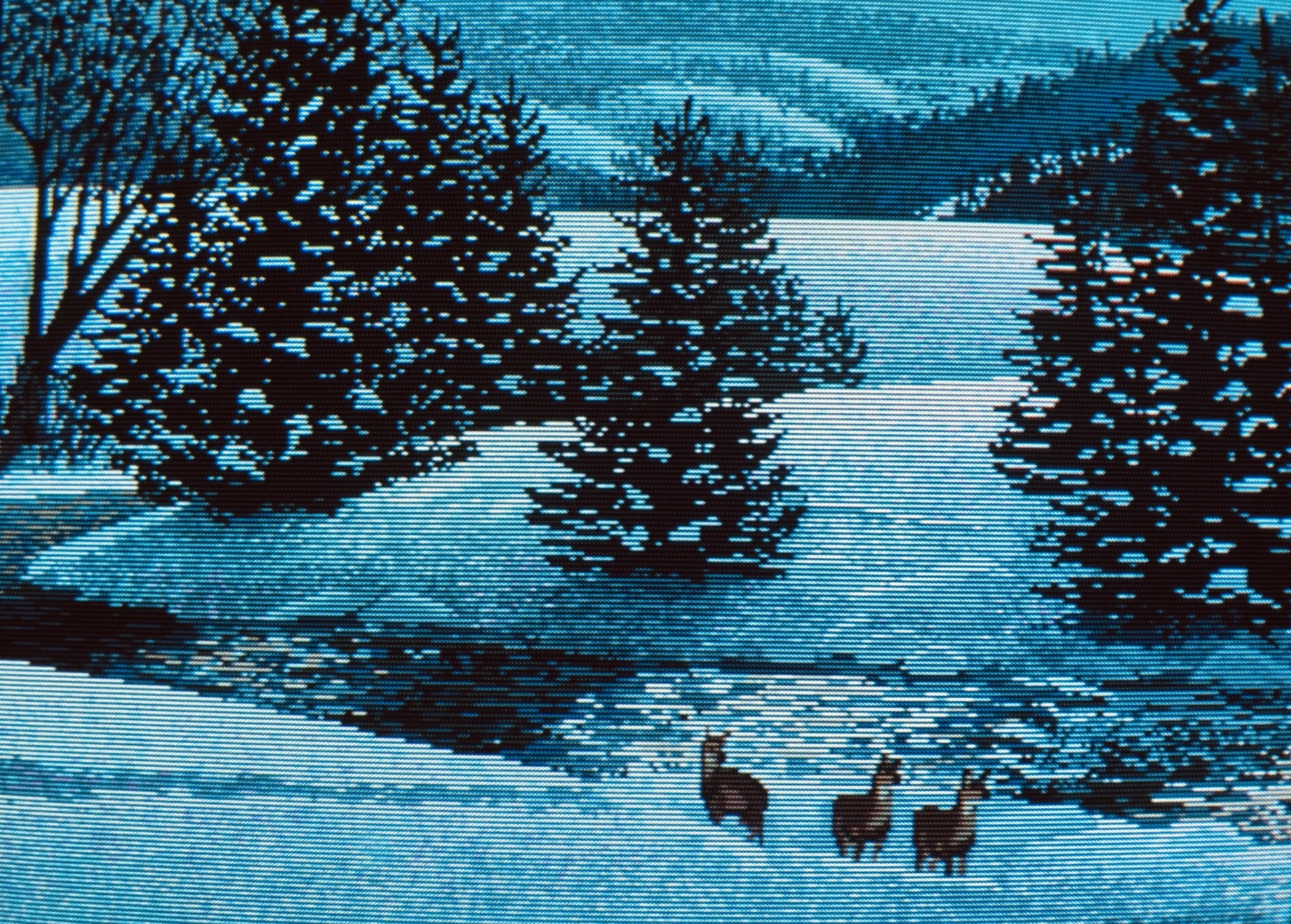
At 320×256 PAL resolution, the pixels are more densely packed together vertically, and although the scanline effect is weaker, it still subtly contributes to the overall “textured” quality of the image:

Essentially, all online flamewars about scanlines versus sharp pixels come down to which particular systems people participating in the debate owned. Guys whose first computer was a PC and grew up with VGA games can rightfully claim that they never saw scanlines on their monitors; the pixels appeared as sharp, chunky little rectangles for them. On the other hand, the Amiga and console folks are certainly not hallucinating either when they keep talking about scanlines and the beneficial smoothing effects of CRTs on low-res graphics.3
Why bother?
People are paying big money for powerful graphics cards these days to enjoy their 3D games with smooth antialiased graphics—back in the 80s we got that smoothing for free in the monitor hardware! Of course, the graphics still had to be skilfully made, but if it was properly antialiased by the artist, the results just looked glorious on a typical Commodore monitor.
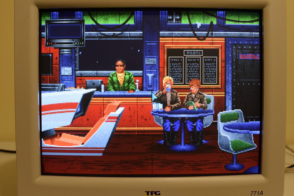
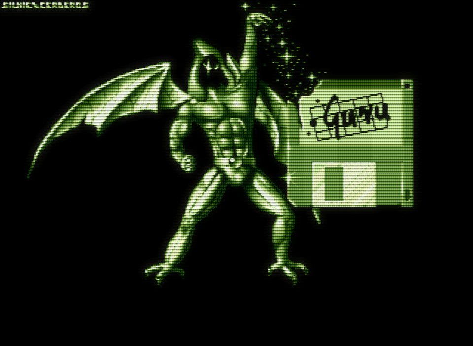
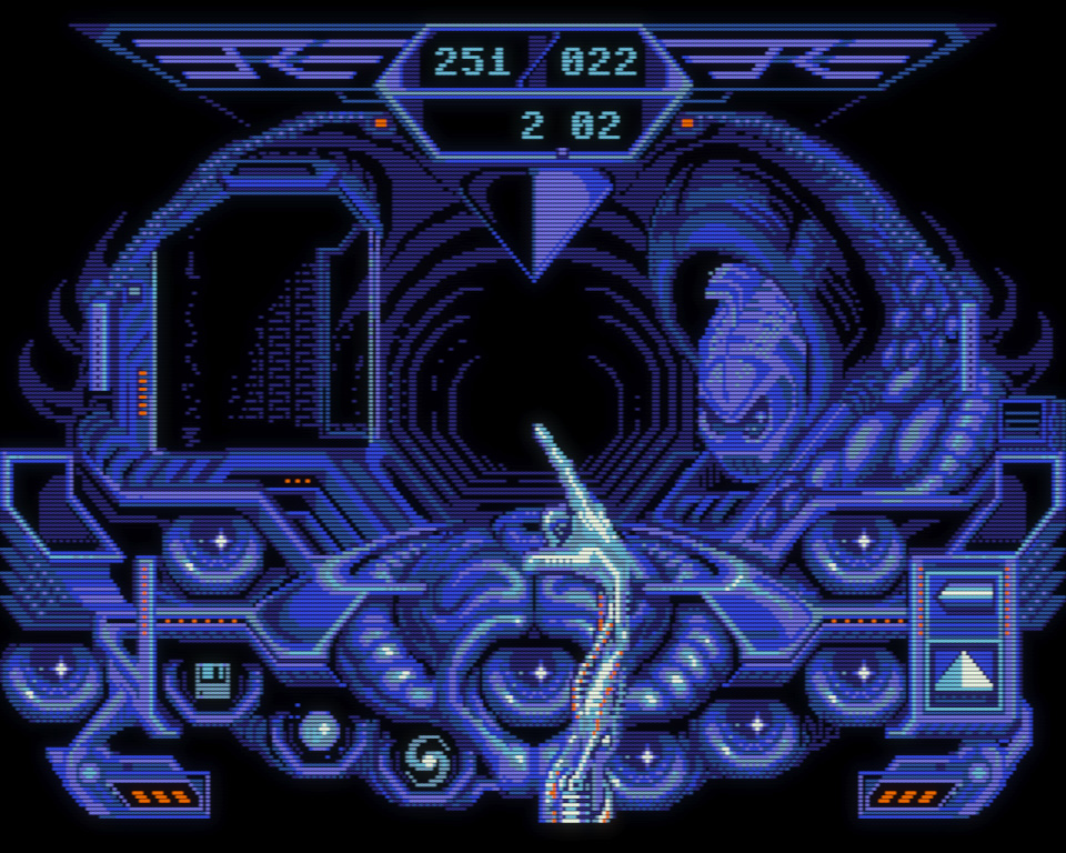
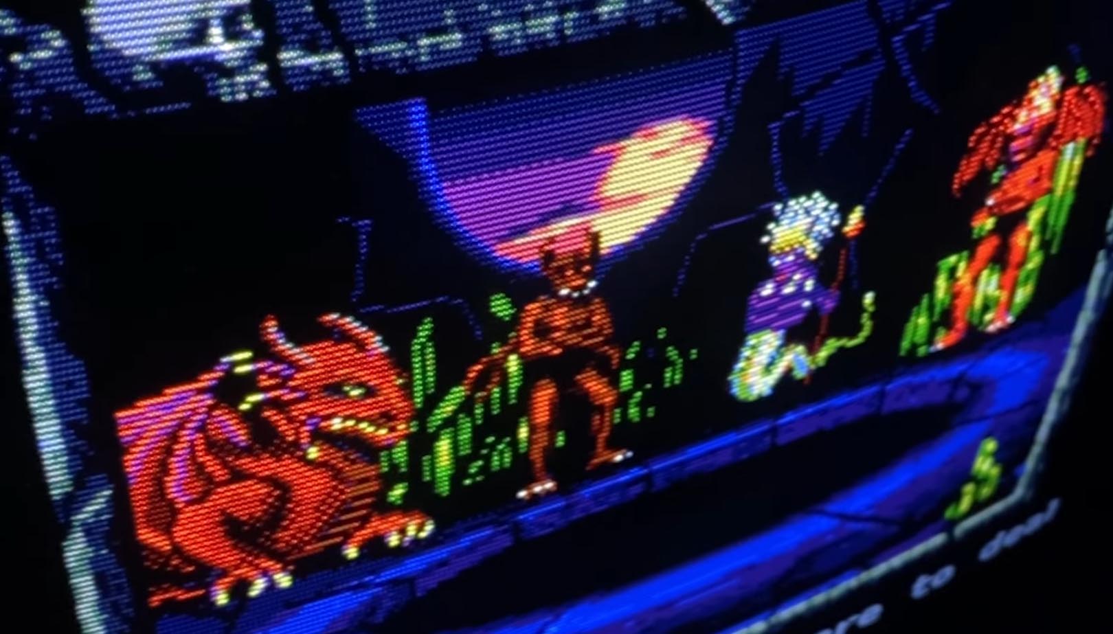
Below is an Amiga artwork with a CRT shader applied to it that simulates the quintessential Commodore 1084S monitor (click on it for a larger version, and click again if the cursor turns into a magnifier glass to have it displayed with 1:1 pixel mapping; this is crucial for all images presented in the article that demonstrate the shaders). I’d bet that most people could not correctly guess that this is in fact 320×256 / 64-colour pixel art (the actual image is even smaller; it fits within a 274×216 rectangle). Subjectively, it certainly looks higher resolution than that; there’s an almost 640×480 SVGA quality to it. The gradients and the curves appear super smooth, you can’t see any jagged edges and chunky pixels like you would on an objectively higher-quality VGA monitor displaying the exact same image!
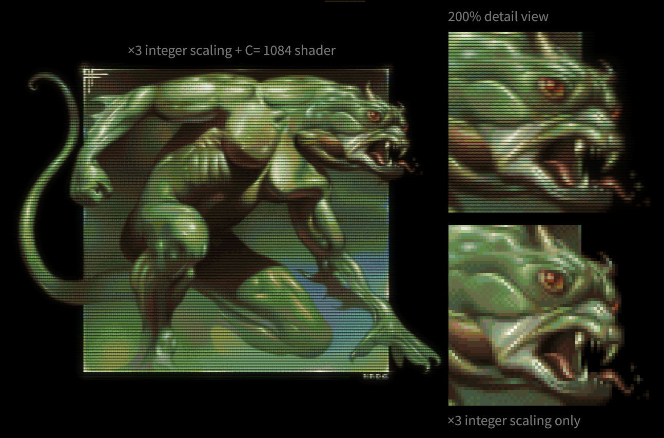
Scarecrow by Made (320×256 / 64-colour Amiga AGA pixel art)
The image was 3× upscaled with a CRT shader. Notice on the 200% view how the shader melts away all the blockiness, smoothes out the dither patterns, increases the perceived resolution, and adds subtle texture to the image. None of that is present in the straight 3× integer upscaled version. That’s analog versus digital for you, in a nutshell (emulated analog, but still).
What some people don’t realise is that you are not really drawing a “mosaic image” when creating “pixel art” on the Amiga (or any other single-scanline computer or console intended to be used with a CRT display). The pixel grid is merely a control mechanism for the artist to “command” the electron beam to perform its analog magic with blending, bloom, glow, and a host of other CRT-specific artifacts. These “commands” effectively modulate the electron beam that paints each raster line from left to right, top to bottom, 50 (or 60) times a second, superimposing a little focused speck of light with a soft-falloff over the fixed phosphor and slot mask patterns. There are no pixels to speak of on a CRT screen!
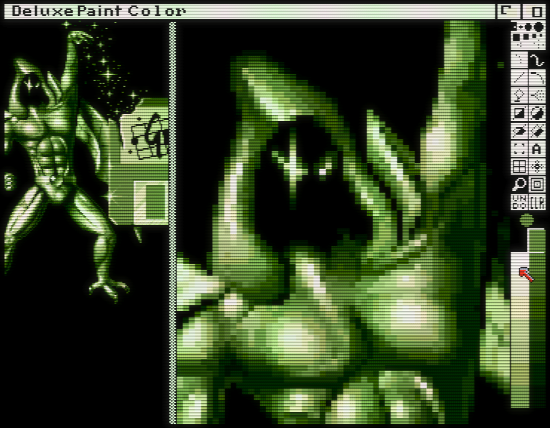
Although I’m nowhere near the true pixel-wizards of the Amiga, I’ve done a fair bit of pixeling in Deluxe Paint, and this dichotomy between the zoomed-in pixel grid and what you actually saw on the unzoomed image on the CRT was pretty obvious to every artist who didn’t completely suck (whether they consciously realised what they were really doing or not).
So, as we can see, measurable improvements in technical specifications don’t necessarily always translate into better outcomes, especially when human perception and something as subjective as art is involved. For me personally, pixel art viewed on Commodore monitors from the 80s is pure magic, and we lost that during transitioning to the technologically superior, higher-resolution PC VGA monitors in the 90s. From 1985 to about 1995, a generation of Amiga artists and enthusiasts had been fixating their gazes upon the flickering analog magic that was the Commodore 1084S, and that’s something I think is well worth understanding and preserving. And it’s just heaps of fun! Using WinUAE with an emulated 1084S puts me in a good mood every time; although it’s not perfect, it gets me a little closer to the experience of sitting in front of a real Amiga. And how long until all Commodore monitors finally die and end up in the junkyard? Like it or not, emulation is the only practical way going forward.
Things worth emulating
Having said all that, it’s not all roses with analog CRTs. People fondly remember the visually pleasing aspects of this display technology, but nobody misses flicker, vignetting, and geometric distortions of the non-flat picture tubes—just to name the worst offenders. Naturally, we will not be emulating any of these undesirable elements.
What we will be emulating is the following:
- period-correct physical image dimensions and aspect ratio
- electron beam illuminating the phosphors on the screen (versus sharp rectangular pixels)
- scanlines (subtly different between PAL and NTSC)
- phosphor and shadow mask patterns
- the characteristic colour reproduction of the Philips picture tube
- bloom, halation, and glow
We won’t be looking at emulating any temporal artefacts (e.g. motion blur, afterglow, etc.) as WinUAE has no support for such effects currently.
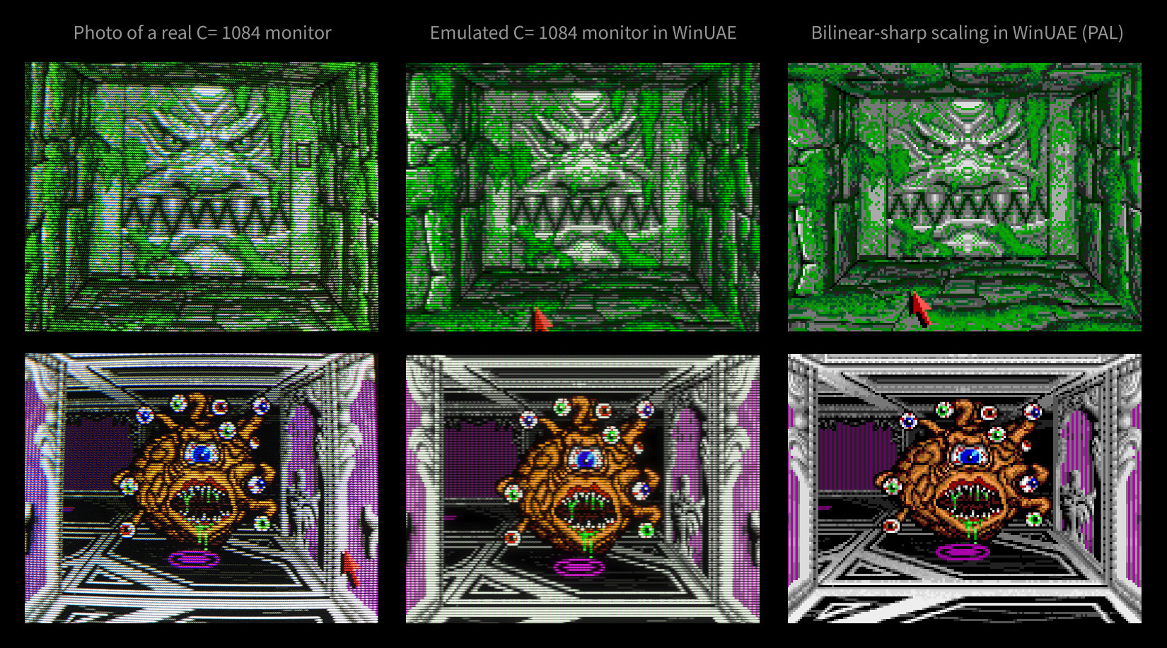
Here is a fun experiment on how the shaders hold up against a real Commodore 1084S monitor. The photos were taken from the Eye of the Beholder review published at AmigaLove. I highly recommend perusing this site as it’s one of the best online sources of good quality photos of games running on Commodore monitors; of course, the articles themselves are very well-written and informative too. Close-up photos of CRTs viewed on LCD screens don’t nearly tell you the whole story, but I’m actually quite surprised to see the emulated results be this close to the real thing!
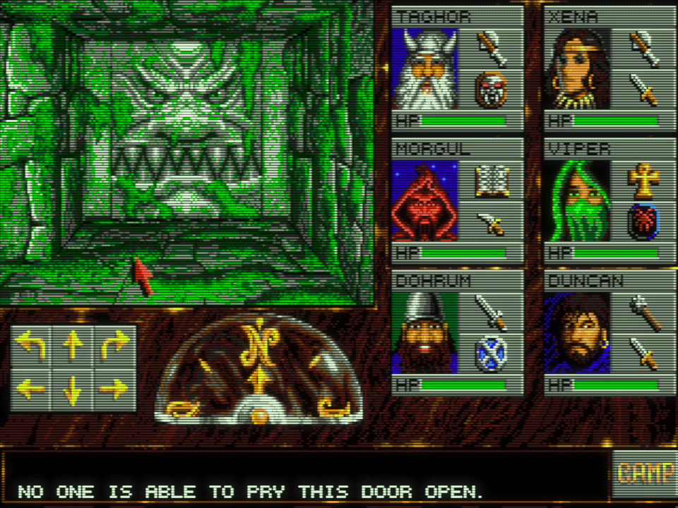
That’s fine for low-res, but what about hi-res content? There’s nothing more annoying than quitting a game and having to switch the shader off because it only supports low-res and makes the Workbench screen unreadable. If you’re like me, that will take you right out of your retro-computing bliss in a jiffy! Fortunately, I have good news for you: the shader we’re going to use supports all OCS Amiga screen modes and therefore looks glorious in 640×512/400 hi-res too!
A few quick words about human psychology
Before we begin, it’s worthwhile to point out that your perception can play tricks on you, so at the very least, it’s good to be aware of a few basic psychological facts about human perception.
Firstly, we’ve been conditioned into thinking that more, bigger, louder, faster, etc., always equals better. Some of this might be evolutionary, some just a product of the times we live in, and maybe it’s even true most of the time, but not always. It’s very easy to outright dismiss an experience because it seems “inferior” according to some preconditioned criteria, but if you keep an open mind and try to live with it for a while, you might start to appreciate some of its not-so-obvious qualities (e.g., a “less sharp” image could make gradients and dither appear smoother, gently melt away all the jagged edges, and subjectively might seem more “cosy”—not unlike the certain magic of technologically inferior (strictly speaking, when looking at specs and measurements only) old analog recordings versus surgically precise digital audio reproduction).
Secondly, the order of experiencing things matters. Going from sharp to less sharp, highly saturated to less colourful, louder to quieter, etc., always feels like “losing something.” But look away from your monitor for 10–20 seconds, then look again at the “less sharp” image—wow, now it seems pretty normal! Switch back to the 100% sharp version—hmm, that’s weird; now that seems too clinical in comparison, and I’m not even so sure anymore if that is “better”!
As I said, I don’t want to suggest to you what your experience should be exactly (I couldn’t really do that, could I?); it’s just good to be aware of these mechanisms, otherwise they can be quite perplexing and could make you run around in circles, psychologically speaking.
Credits
The shaders presented in the article are the works of Guest, who originally published them in the English Amiga Board forums (you can read the original discussion here). Since then, he has made his WinUAE shader pack available on GitHub. Apart from the emulation of the Commodore A2080 monitor, which I’m going use in this article, the collection also contains several other interesting things, such as an arcade CRT shader, and a recreation of the Sony Trinitron displays. They’re certainly all worth a try!
Guest’s current bleeding-edge shader-related work can be followed in this LibRetro forum thread. Although only available for RetroArch/LibRetro at the moment, it’s worth checking out, and we can only hope his work will be eventually ported to WinUAE in the future (once it has support for more advanced shading techniques).
Image dimensions
As explained above, the physical dimensions of an Amiga monitor were effectively standardised, at least between about 1985–1995. This is important because if you play games featuring low-res artwork (320×256 PAL or 320×200 NTSC) designed for 14" CRT screens fullscreen on a 24" or larger monitor, they will look like crap—everything will look too big and overly blocky. The best way to experience those old games as their creators intended is to match the physical dimensions of the emulated computer’s image to that of a 14" monitor. Eerily enough, with 3× integer scaling, you will get almost exactly that on a typical 24" LCD (just draw a 960×720 rectangle and measure its diagonal with a ruler; it will be 13", which equals the diagonal viewable area of the Commodore 1084S).
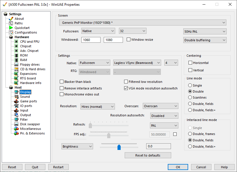
Now, WinUAE is the greatest Amiga emulator ever, and I absolutely love it, but I’ll be the first to admit that the display settings require pilot training. Things are hunky-dory until all you care about is stretching the image to fill the whole screen (just use the Fullscreen (TV) or Fullscreen (Max) scaling method in the Filter section, and set Aspect Ratio Correction to Automatic), but once you want to set up exact scaling ratios and image dimensions, the UI is not on your side anymore, to put it politely. Long story short, after countless hours of tinkering, I stumbled upon the One True Way™ of getting predictable results in the exact way I wanted, so that’s what I’ll describe next.
This is what your Display settings should look like. These are the settings for PAL; of course, you could also use NTSC, and you might want to use windowed mode or a different vsync method. But the rest must be set exactly as shown, and all the Brightness, Contrast, Gamma, etc. settings must be at zero (otherwise they’ll screw up things royally when we get to the shader and colour profile setup later). Ticking the two Centering checkboxes surely seems enticing, but I recommend against it as it will lead to all sorts of problems when switching resolutions or moving screens vertically (we can always adjust the image position manually in the Filter settings if needed).
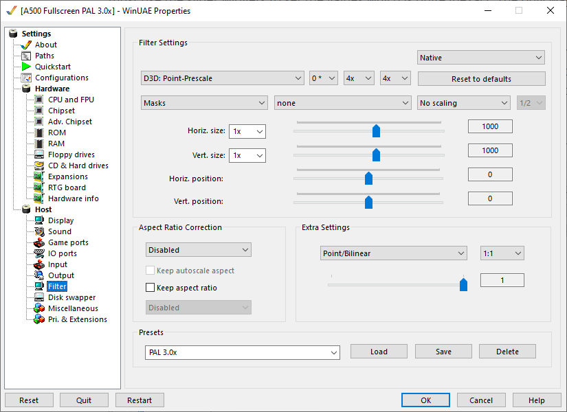
Now the Filter settings; again, you must set up everything exactly as shown. With these settings, we’ll have full manual control over the scaling with the Horiz. size and Vert. size sliders. Unfortunately, the numerical input boxes are read-only, so we must use the slider widgets to set the values, which is rather inexact and cumbersome. The only way to make fine adjustments on the GUI is with the cursor keys while the slider is in focus. Better yet, just edit the config files directly to set up the correct values, or download my shader pack, which contains all the configs you’ll need.
With our settings so far, we’re getting 2× integer scaling with both sliders at 0—that’s a nice clean starting point. After some trial and error, I managed to reverse-engineer the magic formula for applying further scaling on top of that:
(ScalingRatio – 2) × 1000
So if we want 3× scaling, we’ll need to set both scaling factors to (3 – 2) × 1000 = 1000.
As I said, 3× scaling will give us the authentic 1084s image size on a typical 24" 1920×1080 LCD monitor. The rest of the article assumes this display type, so keep that in mind (you’ll need to adjust a few things for 4k screens—this is an exercise for the reader). This handy calculator will help you if you want to adapt my settings to other display size and resolution combinations.
Sometimes we can deviate from 3× scaling with good results. For example, Pinball Dreams is quite enjoyable at 3.5× when leaning back a bit, and I like to play Rick Dangerous at 3.5× or even 4× because the game doesn’t use the whole screen. Some games benefit from a slightly larger image, some don’t—you’ll need to experiment and use your judgement. In any case, keep in mind that 3× scaling will give you the “canonical” image size that people were looking at sitting in front of their monitors back in the day, so that should always be your starting point.
The following table lists some useful scaling values along with the resulting image dimensions in pixels, and their equivalent CRT sizes when viewed on a typical 24" 1080p LCD:
| Scaling ratio | Horiz. size | Vert. size | Width (px) | Height (px) | Equivalent CRT size (on 24"/1080p LCD) |
|---|---|---|---|---|---|
| 3.0× | 1000 | 1000 | 920 | 768 | 14" (13.0" viewable) |
| 3.2× | 1200 | 1200 | 1024 | 819 | 15" (13.8" viewable) |
| 3.5× | 1500 | 1500 | 1120 | 896 | 17" (15.5" viewable) |
| 4.0× | 2000 | 2000 | 1280 | 1024 | 19" (17.3" viewable) |
I recommend saving these settings as presets so you can conveniently switch between them (loading a filter preset won’t restart the emulated machine). The quick & easy way is to download my preset pack, load the configs (I’ve included one for every scaler setting) and then create filter presets for each. Filter presets don’t get saved as files in the config folder (probably they’re stored in the registry), hence this is the workaround I recommend. Don’t worry about the NTSC presets just yet, we’ll get to them in the next section.
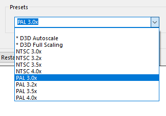
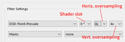
As shown on the Filter screenshot above, if you only want period-correct scaling but don’t care about the CRT shader (in which case you’re missing out a lot, of course, but whatever 😎), you’ll need to use the Point-Prescale shader in slot 0 with both horizontal and vertical oversample factors set to 4x.
This will give you sharp-bilinear-like rescaling in low-res modes, but in hi-res (640-pixel-wide modes) the results will leave a lot to be desired. To properly fix that, you’ll need to use the CRT shader.
Aspect ratio
This topic has already been discussed to death a thousand times, but far too many people still get it routinely wrong. Why’s that so, it’s a bit of a mystery as the whole concept is not that difficult to grasp. Here’s my stab at explaining it unambiguously with as few words as possible (but not less!)
PAL vs NTSC
Before about 2005, all commonly used consumer TVs and monitors were 4:3 display aspect ratio.
On PAL Amigas, non-interlaced & non-overscanned low-res is 320×256 and the pixels are square4 (1:1 pixel aspect ratio). To display the 5:4 aspect ratio image (320:256 = 5:4) on a 4:3 display aspect ratio screen while keeping the pixels square, the image needs to be slightly pillarboxed (it fills the screen vertically, but there are two very narrow black borders on the sides, as shown on the photo in this article).5
- On NTSC Amigas, standard low-res is 320×200 (because NTSC has less vertical resolution). Because the image fills the screen completely, the pixels need to be 20% taller than wide (1:1.2 pixel aspect ratio6). This is commonly referred to as “NTSC stretch” in the popular vernacular.7
The same rationale applies to every other standard OCS Amiga screen mode and their overscanned variants. The most important thing to remember is that the vertical stretch factor of NTSC screen modes is always 1.2 in relation to their PAL counterparts, without exception.
This is nothing too controversial so far, is it? PAL users had square pixels, NTSC users slightly tall ones, and the image always filled the screen on both standards (not exactly 100%, as explained in the footnotes, but close enough).
North American games on PAL computers
Now, certain complications arise from the fact that most NTSC games designed by Americans (or Canadians), originally intended for the US/Canadian markets, were also made available in PAL countries (e.g. Europe and Australia). As early Amigas with the OCS chipset were not PAL/NTSC switchable in software (like later models that had the “fat” ECS Agnus, or the even later AGA machines that had her successor, Alice), and many monitors and TV sets supported only PAL or NTSC, but not both, these PAL conversions had to use PAL screen modes. This meant the original NTSC graphics occupied the upper 320×200 area of a 320×256 PAL screen, leaving the bottom 56 lines blank (assuming low-res). As a result, the art appeared vertically squashed by about 17% compared to the NTSC originals (some people call this the “PAL squash”).
Now, what you must understand is that these games were made in North America, on NTSC monitors that stretched the 320×200 image to fill the whole 4:3 screen. Therefore (whether like it or not) everybody on PAL systems experienced these games incorrectly with the wrong aspect ratio back in the day (“PAL squashed”), not as the original artists intended! (Including me, because I grew up in Europe—I’m not an American preaching to everybody that “Europeans got it all wrong” or something… I’m just simply stating historical facts.)
Let this sink in a bit.
You must understand that the only reason for this rather precarious situation is the technical differences between PAL and NTSC, and the fact that drawing the art twice for both systems would have been prohibitively expensive, so no wonder no company had ever done that.
Now, some people from PAL countries might concur that they only ever experienced these games with squashed art (and potentially running 17% slower because of the 60 vs 50 Hz difference); that’s how they remember them, and that’s what they want to emulate for nostalgic reasons. It’s hard to argue with that logic, indeed—if those are your memories, then that’s the end of it. But keep in mind the “PAL squash” only happened because of practical considerations (mainly due to budgetary limitations); it wasn’t a deliberate artistic or creative intention, but an unfortunate necessity. Then the real question is this: do you want to emulate these games as you remember them, or how their creators intended them to be experienced? And wouldn’t it be nice, after all these years, to finally enjoy them in their most authentic, undistorted form?
It’s not just about the video
Many of these PAL conversions were less than perfect and did not account for the ~17% slowdown that happens when a game synced to the 60 Hz NTSC vertical refresh rate is running in 50 Hz PAL mode. Quite often, the music playback was synced to the screen refresh, which makes the slowdown fairly easy to spot (if the game also has a DOS port, one of the surest ways to ascertain the correct music playback speed is to listen to the DOS version. But be careful: just because the music plays at the correct speed, it doesn’t mean it’s OK to run the game in PAL—the aspect ratio of the graphics is still wrong!)
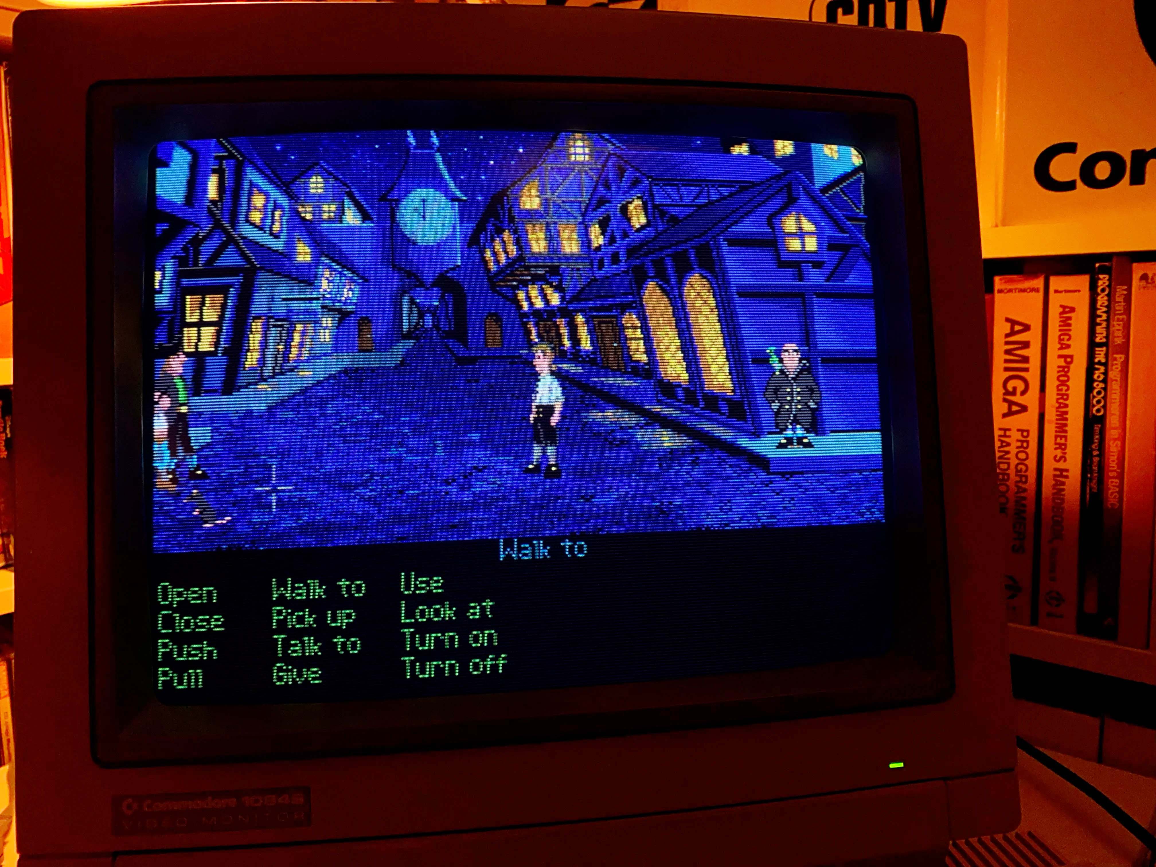
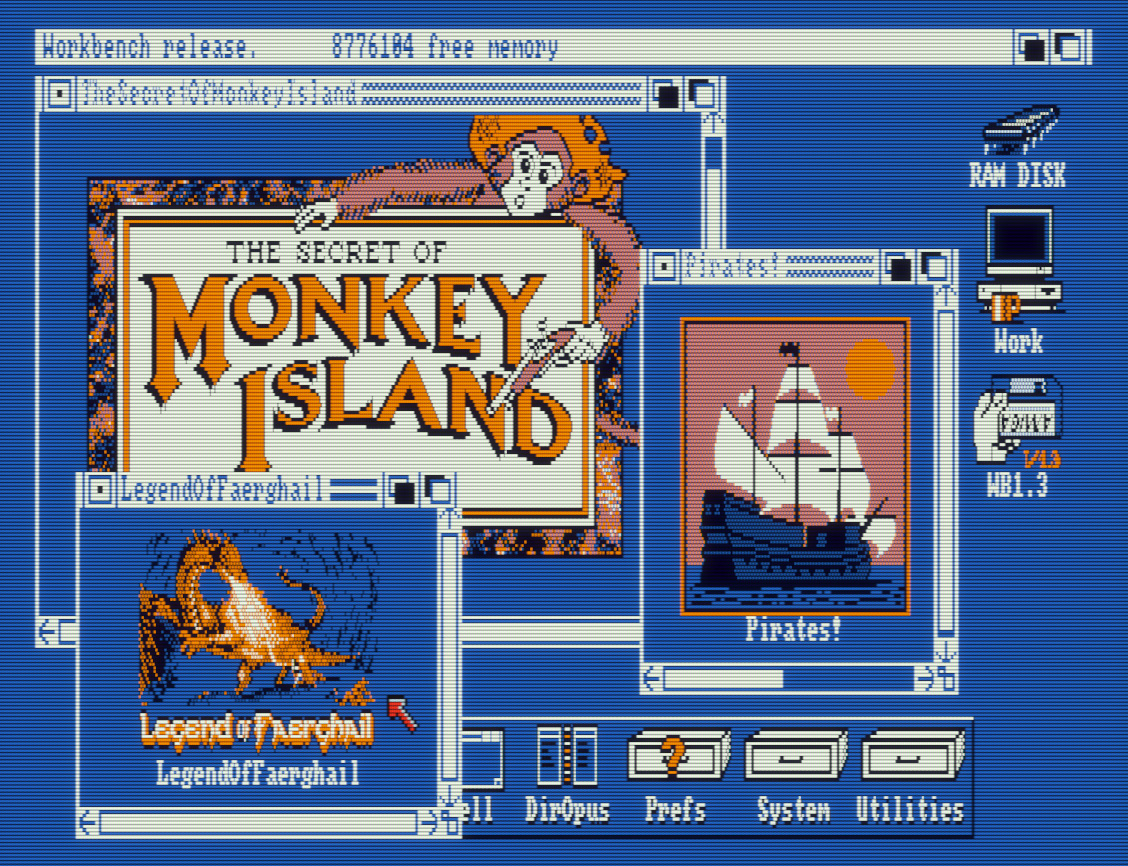
Check out this video for a demonstration of the PAL vs NTSC differences on the classic game Secret of Monkey Island. (By the way, it’s worth watching the whole thing from the beginning, it’s very informative and enlightening—but at the very least just watch this little snippet.)
To cite a few examples of my own, the music plays noticeably slower in the following American-made games in PAL mode, while in NTSC mode the music speed perfectly matches that of the DOS versions:
- Eye of the Beholder I-II
- Indiana Jones and the Last Crusade
- Pool of Radiance8
- King’s Quest 2
- Space Quest 3 (probably all Sierra games are affected)
In some better-coded games that handle both PAL and NTSC correctly, there is no difference in gameplay or music playback speed (but the aspect ratio is still wrong, so definitely play these in NTSC):
- Curse of the Azure Bonds
- Loom
- Phantasie 1
- Pirates!
- Secret of the Silver Blades
- Windwalker
The moral of the story is that you can rarely go wrong by using NTSC mode for all North American titles (which includes a significant part of the whole Amiga gaming catalogue). Without a doubt, that’s the preferable option; the graphics will appear undistorted, exactly as the creators intended, and the game will run at the correct speed, including music playback. (Theoretically, the only time you can run into problems is when you use a PAL crack of an NTSC game that somehow breaks NTSC compatibility.)
While online game databases such as MobyGames
and Hall of Light are certainly very useful
resources, they’re not doing their part to promote aspect-ratio correctness.
In fact, their net contribution is negative in this regard, as most of the
screenshots on their websites are in the wrong aspect ratio (99.99% of them
being 1:1 pixel aspect ratio raw captures from emulators, even for games where
that’s obviously incorrect, e.g. the vast majority of 320×200 DOS
games).
To my knowledge, the maintainers of both websites have been called out about
this issue repeatedly, but they don’t seem to care and are generally
uninterested in trying to improve the situation (to be somewhat fair to the
Hall of Light, that’s a website run by Europeans,
and, as I explained, most people on PAL Amigas experienced NTSC games with the
wrong aspect ratio back in the day). The same goes for 90% of gaming related
blogs and YouTube videos—they get the aspect ratio more often wrong than
correct.
So take everything you see online with a pinch of salt; we know all too well
how easy it is for misinformation to spread on the Internet. And you know the
saying about billions of flies not being wrong…
Running games in NTSC
Sadly enough, as Amiga software preservation efforts seem to be almost exclusively concentrated on PAL releases for whatever reasons, disk images of NTSC originals are extremely hard to come by. But simply forcing NTSC mode with the PAL versions widely available online should do the trick in most cases.
These are the two best ways to do that when using emulation:
For WHDLoad conversions, forcing a game to run in NTSC mode is as simple as adding the
NTSCtooltype to its launch icon. This will work fine on a typical emulated PAL Amiga 1200 setup; the game will open an NTSC screen, and WinUAE will automatically apply the correct vertical aspect scaling ratio on top of our manually set 3.0-4.0× PAL scaling. That’s good news because we don’t need to keep switching between the PAL and NTSC scaling presets when playing different games. This method requires the NTSC monitor driver to be installed—just drag the NTSC icon from theMonitorsdirectory on the Storage Workbench installer disk toDevs/Monitorson your system drive, reboot, and Bob’s your uncle!If you plan on playing games on an OCS/ECS Amiga 500 with Kickstart 1.2/1.3 (a most prestigious choice 🧐), you’ll need to emulate an actual NTSC chipset. It’s very simple: just tick NTSC in the Chipset configuration section. Now, if you turn on automatic aspect ratio management in WinUAE (in the Filter section select Fullscreen (TV) or Fullscreen (Max) scaling and set Aspect Ratio Correction to Automatic), WinUAE will apply the correct aspect ratio correction right from the boot screen. But as I explained previously, this only works if you’re happy with the image being automatically stretched to fill the whole screen. If we want to keep using our exact scaling methods, the automatic aspect ratio correction won’t work, so we’ll need to incorporate the NTSC stretch ourselves into our scaling factors as shown below:
| Scaling ratio | Horiz. size | Vert. size | Width (px) | Height (px) | Equivalent CRT size (on 24"/1080p LCD) |
|---|---|---|---|---|---|
| 3.0× | 1000 | 1600 | 920 | 720 | 14" (13.0" viewable) |
| 3.2× | 1200 | 1840 | 1024 | 768 | 15" (13.8" viewable) |
| 3.5× | 1500 | 2200 | 1120 | 840 | 17" (15.5" viewable) |
| 4.0× | 2000 | 2800 | 1280 | 960 | 19" (17.3" viewable) |
I recommend creating presets for the NTSC settings as well so you can easily switch between them at will:
If you have vsync enabled, your screen refresh rate must be 50 Hz for PAL and 60 Hz for NTSC, respectively; otherwise, you’ll be experiencing all sorts of weird speed issues (e.g. jumpy scrolling, audio glitches, music playing much slower or faster than it should, etc.) With vsync off this is not a problem, so that’s a good quick way to examine how a WHDLoad game behaves in PAL vs NTSC without having to change the screen refresh rate and restart the emulator.
But life ain’t simple
No, we can’t put this whole PAL vs NTSC fiasco behind us just yet… The situation with European-made games is a bit more complicated. The complete algorithm for determining whether a particular title should be played in PAL or NTSC is as follows:
For games originally developed by North American studios—always use NTSC
It does not matter if the Amiga port or the PAL version was made by a European developer; in virtually all cases they just reused the original NTSC graphics assets, and quite often didn’t even attempt to address the 17% slowdown issue.
Some well-known North American studios: Activision, Accolade, Electronic Arts, Westwood, Origin, Interplay, FTL, MicroProse / MPS Labs, SSI, Lucasfilm Games / LucasArts, Sierra, Cinemaware, New World Computing, Sir-Tech, Infocom, Access Software, Electric Dreams, Spectrum Holobyte, Epyx, D.S.I., U.S. Gold, Broderbund, Capcom, SEGA
For games originally developed by European studios (mostly UK):
If the game uses 320×256 or some other PAL screen mode, and the graphics fill the whole screen—always use PAL
If the graphics only takes up a 320×200 or smaller area of the screen, leaving a black bar at the bottom (or at the top and the bottom if they bothered to centre the screen), that does not automatically mean that it needs the NTSC stretch applied to make it look correct; it might very well have been drawn with square pixels in mind still. Perihelion is a good example of this: the graphics is 320×200, but it absolutely needs square pixels (probably they just wanted to play it safe for an eventual future North American release). Exact same deal with Populous 1 & 2, Powermonger, and Midwinter—can’t really fault them; they just wanted to be able to sell their games in North America as well, and stretched graphics is infinitely better than no NTSC release at all.
As for some interesting counterexamples, Captain Blood and the Ishar RPG series were both made by French studios, but their graphics look correct with NTSC stretch (1:1.2 pixel aspect ratio). For the Ishar games, this was most likely because of the DOS versions, but in the case of Captain Blood, producing the graphics with NTSC stretch in mind is a bit more perplexing as it was released on many different platforms (e.g. the ZX Spectrum and the C64) — maybe they wanted to optimise the game for the North American market.
A few important European studios: Bitmap Brothers, Psygnosis, Bullfrog, Horror Soft / Adventure Soft, Magnetic Scrolls, Delphine, Coktel Vision, Revolution, Ubisoft, Infogrames, DMA Design, Core Design, Level 9, Team 17, Sensible Software, Firebird, Digital Illusions, Silmarils, Thalion, Thalamus, Ocean
The game only uses a 320×200 screen area but assumes square pixels.
European-made PAL game that assumes NTSC stretch (1:1.2 pixel aspect ratio)
European-made PAL game that assumes NTSC stretch (1:1.2 pixel aspect ratio)
Although looking at circles and squares to determine the intended aspect ratio may help in many cases, it is not a 100% fool-proof method! It certainly works for most racing games and flight simulators where the circular gauges should usually appear as perfect circles when the correct aspect ratio is being used. But in general, it’s better to look at some common objects and make sure they appear correctly—neither too tall nor too squashed (human faces and full human figures are the best candidates for this).
CRT shader
Congratulations on making it so far; now the display of your emulated Amiga should resemble that of a PC VGA monitor in low-res mode (sharp blocky pixels and all). But unlike VGA, which is double-scanned at 31 kHz horizontal sync frequency, all stock Amigas output 15 kHz single-scanned video signals9, and not even the best Commodore monitors could enter the ring against any average 14" VGA display from the 90s when it comes to sharpness (unsurprisingly, since the IBM PC was originally intended as a business machine, therefore text legibility was of primary concern).
To simulate the roundish “pixels” of the 1084S that slightly blend into each other (a rather nice “natural anti-aliasing” effect that makes low-res artwork so much more pleasant to look at, and lends the image this wonderful “fuzzy analog quality”) and the subtle scanlines (at least on PAL; on NTSC they’re much more prominent), we’ll need Guest’s rather excellent CRT-A2080-HiRes-SmartRes-Interlace CRT shader. This shader is the star of the show, and this makes the biggest difference after matching the physical image dimensions of the 1084S monitor. One of its most remarkable features is that it provides seamless support for all OCS Amiga screen modes in a single shader (320×256 Low Res, 640×256 High Res, 320×512 Low Res Laced, 640×512 High Res Laced, and naturally all their overscanned and NTSC variants). The interlace flicker is not emulated, but probably that’s for the best. This thing handles everything you throw at it, including low-res/hi-res split-screen games (e.g Lemmings, Shadow of the Beast, Apidya, Agony, all Magnetic Scrolls adventures, etc.)

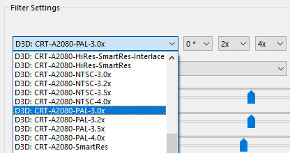
I have tweaked the shader settings a little bit, you can download my customised version from here.
They’re called CRT-A2080-PAL-* and CRT-A2080-NTSC-* and have several variants, one for each scaling ratio (3.0×, 3.2×, 3.5×, and 4.0×). I had to create copies because WinUAE doesn’t support shader presets yet, plus I made the names a little shorter. At 1080p, the scanline emulation can cause vertical interference (moire) patterns even with 4x vertical oversampling enabled, therefore I needed to tweak the scanline strength for each scaling ratio to reduce these artefacts. This is much less of a problem for higher than 1080p displays, for which I recommend using the 4.0x variants as a starting point.
(By the way, in case you’re wondering, “the Commodore A2080 was essentially a high persistence phosphor model of the 1084 to reduce flicker in NTSC modes”, according to the Big Book of Amiga Hardware.)
Okay, so this is how to set this up:
In the Miscellaneous section, select Direct3D 11 for the Graphics API (and leave it at hardware accelerated, of course). Do not use Direct3D 9 as that will result in uneven scanlines for some reason.
Put the
CRT-A2080-*.fxshader files intoplugins\filtershaders\direct3din your WinUAE installation directory and restart WinUAE.In the Filter section, select one of the CRT-A2080-* shaders in slot 0, and set 2x horizontal and 4x vertical oversampling. If you have a slower GPU and you’re getting dropouts, you might want to reduce this a little, but don’t go below 3x vertical oversampling (this is essential to make the scanlines nice even and interference-free; 1x horizontal and 3x vertical is the recommended minimum). Oversampling takes a big hit on performance, e.g. with 2x horizontal and 4x vertical oversampling, your GPU would need to perform 2×4=8 times as much work!
Detail view of the NTSC 3.0× variant in action on a scene from Defender of the Crown:
Right: CRT-A2080-NTSC-3.0x shader
The PAL 3.2× variant is especially prone to exhibiting vertical interference artefacts on solidly filled areas at certain luminance levels (e.g. full white). There’s not much to do about this; this is just a result of certain non-integer scaling ratios at 1080p. If it really bothers you, use 3.0× or 3.5× PAL scaling instead. The NTSC presets are far less affected as NTSC scanlines are spaced a bit further apart which prevents such interference patterns from developing.
CRT colour profile and monitor controls
The next thing that will make a huge difference in replicating an authentic CRT experience is emulating the colour profile of the Commodore 1084S monitor. Most modern displays are calibrated for sRGB out-of-the-box that uses D65 (6500K) white point. This is noticeably cooler (bluer) looking than the more warmish/yellowish look of a typical CRT from the 80s, which was closer to 5000K (CRT manufacturers more or less just did whatever they felt like back then; the sRGB standard came into existence in 1996 precisely to remedy this Wild West type of situation).
Guest’s WinUAE shader pack contains a CRT colour profile filter in ReShade format (ReshadeShaders/WinUaeColor.fx), and one of the included profiles is exactly what the doctor ordered (information about the different profiles can be found here):
[Profile 4] Manually calibrated and compared to real Philips based CRT monitors, running side by side with the shader on a 10-bit DCI-P3 gamut panel. This calibrated CRT profile covers amongst others Philips CM8533, Philips VS-0080, and Commodore 1084.
Note the whitepoint is significantly different from D65. It’s closer to 6100K, but clearly not on the blackbody curve.
Perfect! You’ll need to install ReShade into your WinUAE folder to use this, just follow Guest’s instructions from the README. Now one thing that he doesn’t mention is that the shaders depend on the common ReShade.fxh and ReShadeUI.fxh files that are not included, so just get them from here (all these files are included in my preset pack, by the way).
The WinUaeColor filter also implements brightness, contrast, and saturation monitor adjustment controls. But for best results, we need to apply the monitor adjustments before the shadow mask emulation, and the colour profile emulation after it, as the last filter in the chain. Therefore, I duplicated WinUaeColor under the name WinUaeColorProfile, and our final ReShade filter chain will look like this:
- WinUaeColor (monitor controls only)
- WinUaeMask
- WinUaeColorProfile (Philips colour profile only)
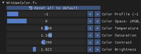
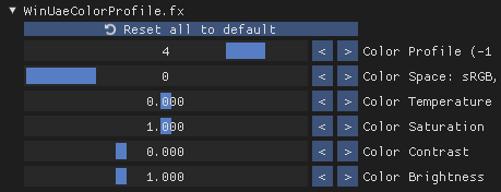
Once you’ve set up everything correctly, just enable WinUaeColor.fx and set it up as shown below. Colour Temperature should stay at zero, and I like to bump up the Color Saturation a little so it resembles the vividness of the Commodore 1084S a bit more. A value around 1.100 should do the trick. You might not need (or want) to boost the saturation on wide-gamut displays, though.
Similarly, I like to increase the Color Contrast to about 0.400 as well as my default setting. Some games look quite nice with the contrast cranked up almost to the max, while some look completely fine at near zero—just like on real hardware.
The almost homeopathic Color Brightness boost of 1.023 helps regain some of the brightness lost by the scanline emulation, and interestingly it also helps reduce moire at non-integer scaling ratios (or perhaps it’s all in my head…)
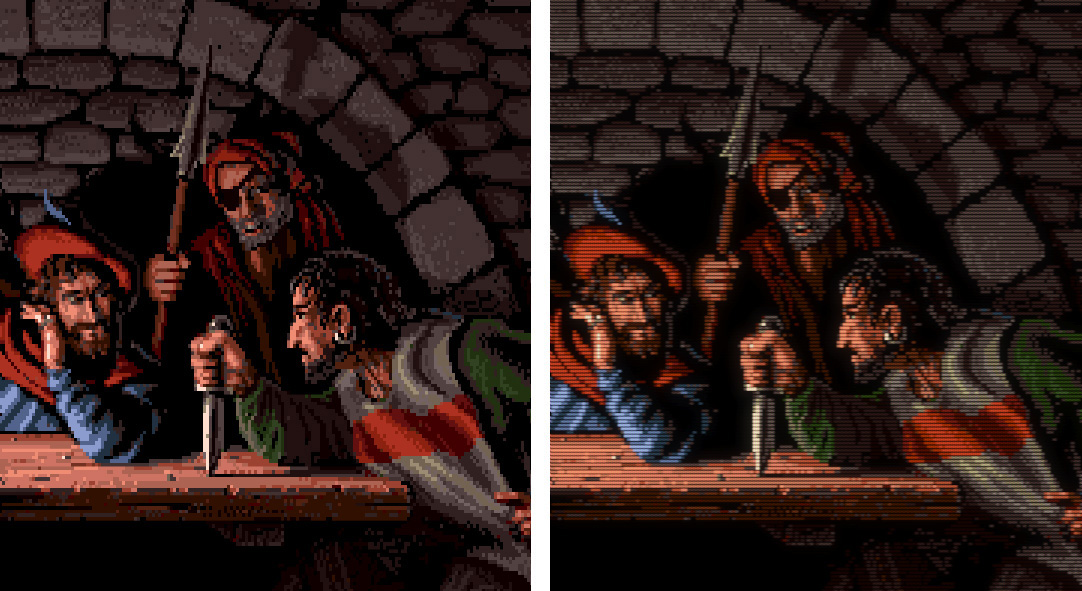
The next thing is to enable WinUaeColorProfile.fx as the second filter in the chain. Color Profile 4 is the Philips, most people should leave Color Space at 0 (sRGB), but if you’re the lucky owner of a wide-gamut display, then you should definitely set it to match your display’s colour profile (the emulation would be more accurate that way, according to the instructions). Leave all the other controls at their default neutral settings—as I explained, we’re using this second instance only for emulating the monitor’s colour profile.
As expected, the right half of the below example image with the Philips colour profile applied looks much warmer and cosier. Now we’re cooking on gas! — this is how I remember my Philips and Commodore monitors, the raw sRGB version looks too harsh and clinical in comparison.
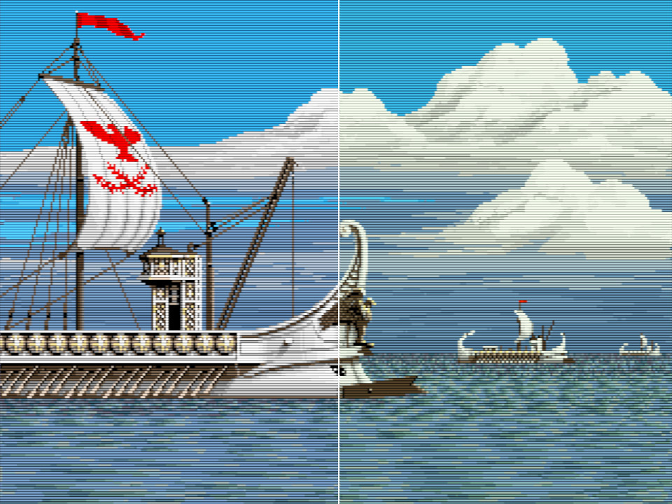
Right: the same image with the Philips colour profile applied
The difference is even more striking on greys, like on this Directory Opus screenshot:
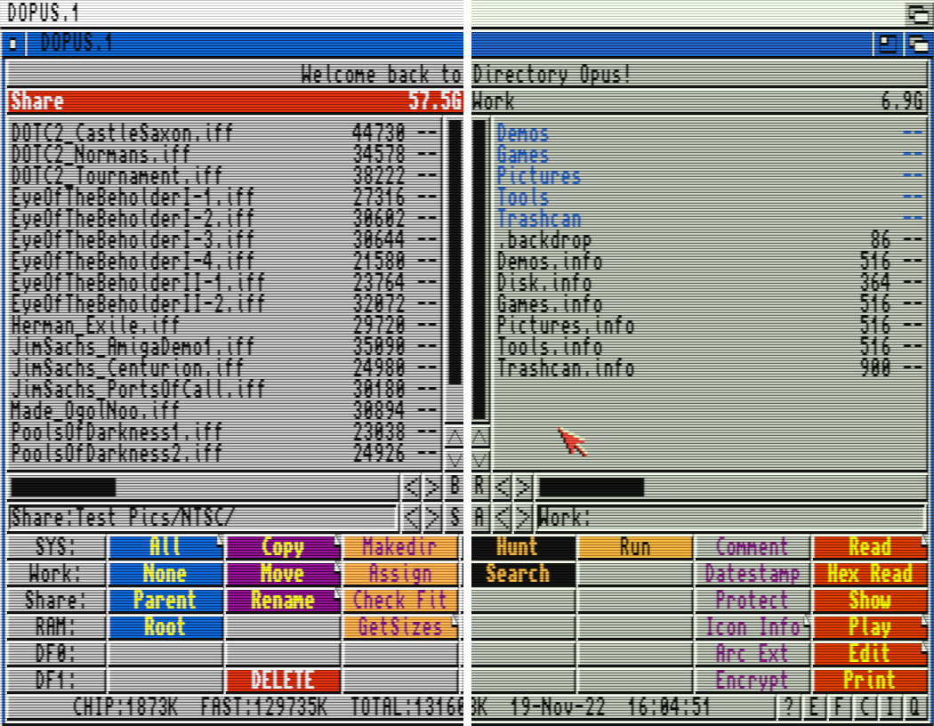
Right: same image with the Philips colour profile
Phosphor and shadow mask
The next step is subtle but important: the emulation of the phosphor pattern and the shadow mask that gives the image a subtle, almost canvas-like texture. Different monitors use different types of shadow masks; the 1084S and most early computer monitors have the slot mask or in-line type which was also commonly used in TV CRTs throughout the 80s.
Right: triad-style dot mask typically used in PC monitors
(source)
The staggered slot mask pattern combined with the relatively low dot pitch (0.42 mm) results in quite visible zig-zag patterns across the scanlines. The effect is especially noticeable in NTSC as you can see in many of AmigaLove’s YouTube videos:
The shadow mask is just as visible in PAL screen modes, and because the scanlines are much closer, the zig-zag pattern almost turns into a fine checkerboard-like texture.
This article gives a good succinct explanation of how these pixel masks are implemented. As I said in the beginning, my settings are really tailored for 1080p. At 4k or higher resolutions, you’ll almost certainly need to make significant adjustments to them.
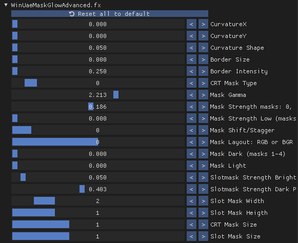
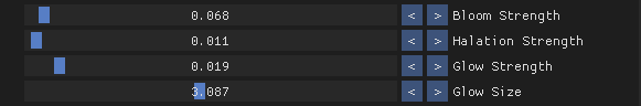
Again, the slot mask emulation is not something that jumps at you as it’s rather subtle, but it’s missing if it’s not there. The lack of it is especially noticeable on large solidly coloured areas; on a real CRT, these were never really solid, there was always something “going on” even in these boring flat surfaces; they had a faint, almost subliminal canvas-like texture. Here are the settings I’m using in the WinUaeMaskGlowAdvanced.fx ReShade filter which must be sandwiched between the two WinUaeColor filters. Explaining the rationale behind these specific settings would require a small dissertation, so I won’t go into that here. They’re the result of dozens of hours of shader tweaking, and if you’re going to modify them, be aware that all settings interact with each other, including the settings of the CRT emulation shader, so you need a holistic view when tweaking these things.
And this is a before/after comparison on a blown-up PAL image. Doesn’t seem like a big deal; it’s one of those strange things that doesn’t seem to add much when you turn it on, but you’ll notice its absence when you remove it after you’ve become accustomed to it. It might even seem a bit pointless at first, but trust me, just set it up, live with it for a while, and then turn it off—chances are you’ll really miss it!
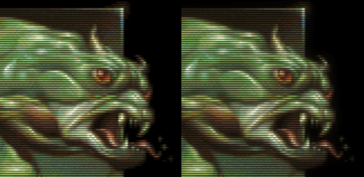
Right: phosphor and shadow mask emulation applied
At this point, you will have noticed that the brightness of the resulting image with scanline, phosphor and shadow mask emulation enabled is a bit dimmer compared to the original. The best way to compensate for this is by increasing the contrast setting of your monitor by about 30% (not the brightness; that sets the black point). If already have your contrast cranked up to the max, well, I guess you’re out of luck! 😎 I use ClickMonitorDDC for this on Windows which lets you adjust your monitor controls via shortcuts. For general everyday use, I have a preset with brightness set to 35 and contrast to 75, then another one for WinUAE with the contrast increased to 96.
Bloom and glow
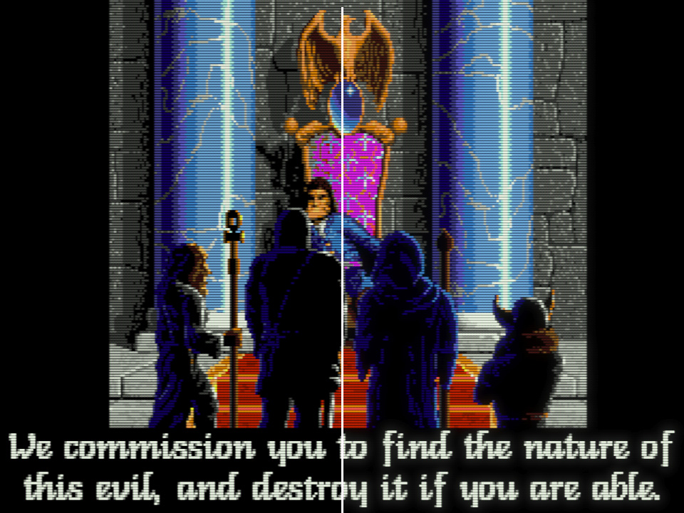
Okay, this is the icing on the cake, a subtle but important final touch to make the emulation even more authentic. CRT displays always exhibit a certain degree of halation, which is quite an interesting effect. As the electron beams illuminate the phosphors which in turn emit light, the light rays entering the front glass close to normal angles pass mostly undeterred, but below a certain angle of incidence, the light is reflected to the picture tube’s surface where it undergoes further reflections. The result is a characteristic concentric glow (“halo”) around brightly lit areas, which also results in a localised loss of contrast. The effect is most noticeable when bright text is displayed on a black background, as shown in the example below.
The “bloom” effect is maybe not named entirely correctly, but it’s basically the effect of brighter pixels appearing a little larger, rounder, and bleeding into their neighbours a bit more. Sort of a pixel-level, small-scale glow effect that incidentally is also useful to make up for the brightness loss caused by the shadow mask overlay.
Luckily for us, the mask and glow shader emulate both phenomena quite convincingly. The trick is not to overdo it (you shouldn’t really notice the effect unless you’re looking for it), so I’m keeping these at rather conservative levels. What I said about the phosphor and shadow mask emulation holds true for these as well: turning them on might not seem overly impressive at first (if you’re impressed, rest assured you’ve overdone it!), but when you turn them off later, you’ll probably miss the effect.
And now the mandatory before/after comparison image:
Right: same image with subtle bloom and glow
Changing shader settings from the Amiga
With the handy little uae-configuration utility included with WinUAE,
you can control almost all emulator settings from within the emulated
Amiga! You just need to copy it to SYS:C, then you can execute it from the
shell like any other Amiga program.
For example, the following commands set the 3.5× NTSC shader preset and scaling factors:
uae-configuration gfx_filter D3D:CRT-A2080-NTSC-3.5x.fx
uae-configuration gfx_filter_horiz_zoomf 1500
uae-configuration gfx_filter_vert_zoomf 2200
Pretty cool stuff, huh?!
I wrote a small AmigaDOS script called SetGfx to make switching between the
8 supported shader and scaling presets even easier; for example, you can execute
SetGfx ntsc35 to switch to the NTSC 3.5× preset. It’s included in the
downloadable shader pack.
Switching between shaders and scaling factors while the emulated Amiga is running can result in WinUAE hanging if you’re using ReShade and windowed of full-window mode. However, it works very well in fullscreen, so that’s what I recommend if you’re intending to switch shader presets on the fly (e.g. to set your preferred scaling factor in a game’s launcher script).
In closing
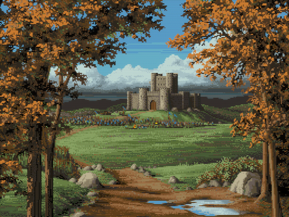
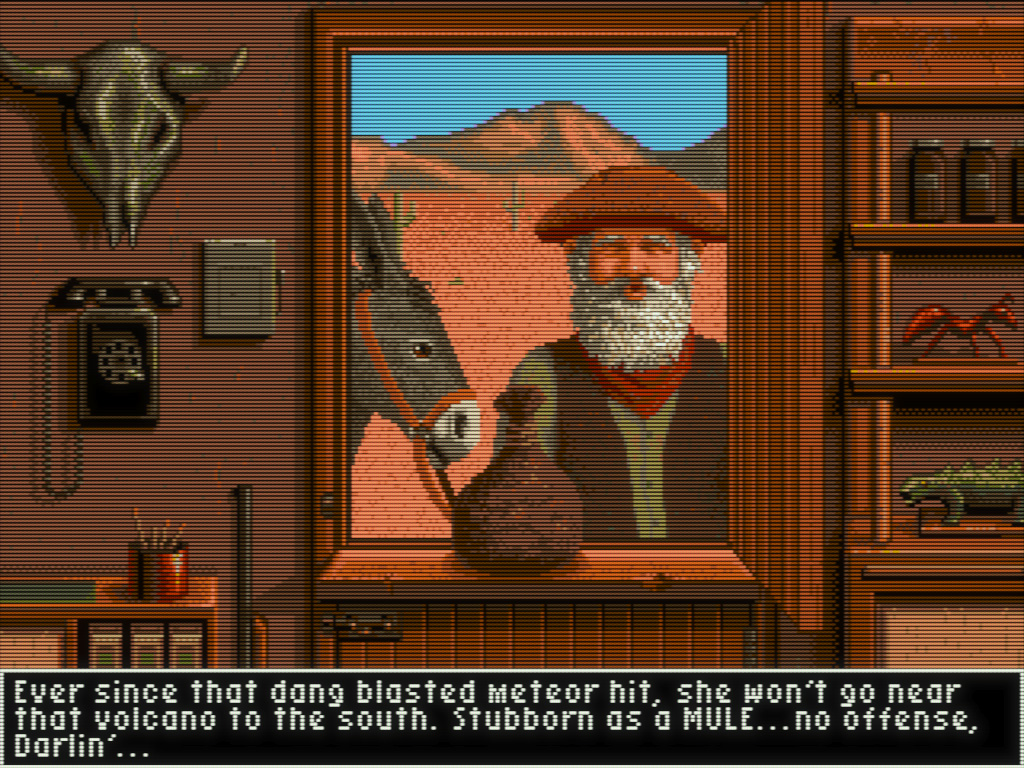
Phew, that was one long article, indeed! Hopefully, you’ve enjoyed my ramblings and have learned something useful. I wish you a nice emulated Amiga experience, and in parting here are some more glorious example images that showcase this excellent shader in action.
Stay tuned for the next episode where we’ll be looking at DOS and early Windows-era graphics, and how to do it right!
Links, files & further reading
Files
Misc
Guest’s shaders
- Latest version of the WinUAE shader pack
- Original releases and discussion
- Guest’s new bleeding-edge CRT shaders
Amiga RKM Libraries Manual — Graphics Libraries
For me, it’s a tie between the classic OCS/ECS Amigas and the venerable Commodore 64 that just turned 40! ↩︎
Yeah, some poor buggers couldn’t afford a monitor and hooked up their machine to a TV, but those were either small 13–14" TV sets, or if they used the big family TV, that had to be viewed from a distance, so the effective image dimensions ended up being about the same (remember, TVs in the 80s were much smaller than today). The Sony PVM and BVM line of monitors seem to be very much in vogue lately in retro-gaming circles, especially in the US because of the almost total lack of small NTSC TVs with SCART inputs over there. I’m sure they’re nice, but remember, the P and B stand for “Professional” and “Broadcast”, respectively. A 20" BVM set you back by about 16,000 USD (!) in the 90s, and the smaller models were not exactly cheap either, often costing well over a grand. Now, how many home users exactly could have afforded these babies back in the day? Zero? I guarantee you that no Amiga enthusiast had owned a Sony PVM/BVM ever before the year 2000. It’s just that companies started throwing them away or selling them for $5 apiece, and the retro crowd quickly snatched them up, creating a small hype in the process — now they command absolutely ridiculous prices on eBay again. In any case, as using one of these is not the authentic experience (they’re too sharp, have aperture masks instead of slots masks, and the scanlines are a bit too prominent because of the increased vertical resolution of 800–1000 lines), we’re not concerned with them here. Another fun fact: as Commodore monitors had excellent image quality and colour reproduction for the time (for SD broadcast standards, that is), they often found their way into professional studios and were sitting next to the Sonys. You could buy several of them for the price of a single Sony; there’s not much arguing with it that they had pretty much the best quality/affordability ratio throughout the 80s. ↩︎
Of course, then there’s the guy who plays everything stretched to 16:9 widescreen with bilinear scaling, and is content with the results he’s getting. Good on him! ↩︎
Yes, I’m aware that the PAL TV standard has 128:117 = 1:1.09402 pixel aspect ratio, so when you hook up your Amiga to a TV, you won’t get 100% square pixels. But the difference is very small, and most people used their Amigas with monitors which had horizontal and vertical stretch controls to set up the picture so it fills the screen. Therefore, I’d say this difference is largely irrelevant, and we should should just assume square pixels for all PAL Amiga screen modes for practical reasons. ↩︎
It’s easy to derive this from the ratios: 4:3 display aspect ratio can be rewritten as 16:12, and the storage aspect ratio of 320:256 = 5:4 as 15:12. Because the vertical ratios are identical, the image fills the screen vertically. However, the display is 16 units wide while the image width is only 15 units, so there will be black bars on the two sides. ↩︎
Same story as for PAL: the “theoretically correct” vertical stretch ratio is not quite 1.2, but close enough that it does not matter. ↩︎
Divide the 320×200 NTSC pixel-grid size by ten to get the 32:20 storage aspect ratio. Multiply the 4:3 display aspect ratio by 8 to arrive at the same width factor; that will give us a 32:24 display aspect ratio. The horizontal factors match, so the image fills the screen horizontally, but not vertically (because 24 > 20); for that we need to stretch the pixels vertically by a factor of 24/20 = 1.2. This is the same vertical stretch factor that must be applied to 320x200 VGA games so they display correctly on square pixel aspect ratio LCD monitors. (Of course, the deeper and true explanation lies in the workings of the NTSC broadcast standard and would require some knowledge of analog electronics. However, for our purposes here this purely aspect ratio based derivation is sufficient.) ↩︎
Pool of Radiance is an interesting case. The Amiga port was made by a European studio, Ubi Soft in France, but clearly it was intended for the NTSC market as the graphics need the NTSC stretch to look correct and the music plays too slowly in PAL mode. ↩︎
Except for the Amiga 3000 which includes a scan-doubled 31 kHz VGA output connector as well. ↩︎
Comments
comments powered by Disqus