What every coder should know about gamma
Table of contents
A short quiz
If you have ever written, or are planning to write, any kind of code that deals with image processing, you should complete the below quiz. If you have answered one or more questions with a yes, there’s a high chance that your code is doing the wrong thing and will produce incorrect results. This might not be immediately obvious to you because these issues can be subtle and they’re easier to spot in some problem domains than in others.
So here’s the quiz:
- I don’t know what gamma correction is (duh!)
- Gamma is a relic from the CRT display era; now that almost everyone uses LCDs, it’s safe to ignore it.
- Gamma is only relevant for graphics professionals working in the print industry where accurate colour reproduction is of great importance—for general image processing, it’s safe to ignore it.
- I’m a game developer, I don’t need to know about gamma.
- The graphics libraries of my operating system handle gamma correctly.1
- The popular graphics library <insert name here> I’m using handles gamma correctly.
- Pixels with RGB values of (128, 128, 128) emit about half as much light as pixels with RGB values of (255, 255, 255).
- It is okay to just load pixel data from a popular image format (JPEG, PNG, GIF etc.) into a buffer using some random library and run image processing algorithms on the raw data directly.
Don’t feel bad if you have answered most with a yes! I would have given a yes to most of these questions a week ago myself too. Somehow, the topic of gamma is just under most computer users' radar (including programmers writing commercial graphics software!), to the extent that most graphics libraries, image viewers, photo editors and drawing software of today still don’t get gamma right and produce incorrect results.
So keep on reading, and by the end of this article you’ll be more knowledgeable about gamma than the vast majority of programmers!
The arcane art of gamma-correctness
Given that vision is arguably the most important sensory input channel for human-computer interaction, it is quite surprising that gamma correction is one of the least talked about subjects among programmers and it’s mentioned in technical literature rather infrequently, including computer graphics texts. The fact that most computer graphics textbooks don’t explicitly mention the importance of correct gamma handling, or discuss it in practical terms, does not help matters at all (my CG textbook from uni falls squarely into this category, I’ve just checked). Some books mention gamma correction in passing in somewhat vague and abstract terms, but then provide neither concrete real-world examples on how to do it properly, nor explain what the implications of not doing it properly are, nor show image examples of incorrect gamma handling.
I came across the need for correct gamma handling during writing my ray tracer and I had to admit that my understanding of the topic was rather superficial and incomplete. So I had spent a few days reading up on it online, but it turned out that many articles about gamma are not much help either, as many of them are too abstract and confusing, some contain too many interesting but otherwise irrelevant details, and then some others lack image examples or are just simply incorrect or hard to understand. Gamma is not a terribly difficult concept to begin with, but for some mysterious reason it’s not that trivial to find articles on it that are correct, complete and explain the topic in a clear language.
What is gamma and why do we need it?
Alright, so this is my attempt to offer a comprehensive explanation of gamma, focusing just on the most important aspects and assuming no prior knowledge of it.
The image examples in this article assume that you are viewing this web page in a modern browser on a computer monitor (CRT or LCD, doesn’t matter). Tablets and phones are generally quite inaccurate compared to monitors, so try to avoid those. You should be viewing the images in a dimly lit room, so no direct lights or flare on your screen please.
Light emission vs perceptual brightness
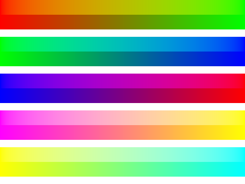
Believe it or not, the difference of light energy emission between any two neighbouring vertical bars in the below image is a constant. In other words, the amount of light energy emitted by your screen increases by a constant amount from bar to bar, left to right.

Now consider the following image:

On which image does the gradation appear more even? It’s the second one! But why is that so? We have just established that in the first image the bars are evenly (linearly) spaced in terms of emitted light intensity between the darkest black and brightest white your monitor is capable of reproducing. But why don’t we see that as a nice even gradation from black to white then? And what is being displayed on the second image that we perceive as a linear gradation?
The answer lies in the response of the human eye to light intensity, which is non-linear. One the first image, the difference between the nominal light intensity of any two neighbouring bars is constant:
$$\Δ_{\linear} = I_n-I_{n-1}$$
On the second image, however, this difference is not constant but changes from bar to bar; it follows a power law relationship, to be exact. All human sensory perception follows a similar power law relationship in terms of the magnitude of stimulus and its perceived intensity.
Because of this, we say that there is a power law relationship between nominal physical light intensity and perceptual brightness.
Physical vs perceptual linearity
Let’s say we wanted to store a representation of the following real-world object as an image file on the computer (let’s pretend for a moment that perfect greyscale gradients exist in the real world, okay?) Here’s how the “real world object” looks like:

Now, let’s pretend that we can only store 5-bit greyscale images on this particular computer system, which gives us 32 distinct shades of grey ranging from absolute black to absolute white. Also, on this computer, greyscale values are proportional with their corresponding physical light intensities, which will result in a 32-element greyscale as shown on Figure 1. We can say that this greyscale is linear in terms of light emission between successive values.
If we encoded our smooth gradient using only these 32 grey values, we would get something like this (let’s just ignore dither for now to keep things simple):

Well, the transitions are rather abrupt, especially on the left side, because we only had 32 grey values to work with. If we squint a little, it’s easy to convince ourselves that this is a more or less “accurate” representation of the smooth gradient, as far as our limited bit-depth allows it. But note how the steps are much larger on the left side than on the right—this is because we are using a greyscale that is linear in terms of emitted light intensity, but as we have mentioned before, our eyes don’t perceive light intensity in a linear way!
This observation has some interesting implications. The error between the original and the 5-bit encoded version is uneven across the image; it’s much larger for dark values than for light ones. In other words, we are losing representational precision for dark values and are using relatively too much precision for lighter shades. Clearly, we’d be better off choosing a different set of 32 greys for our limited palette of shades that would make this error evenly distributed across the whole range, so both dark and light shades would be represented with the same precision. If we encoded our original image with such a greyscale that is perceptually linear, but consequently non-linear in terms of emitted light intensity, and that non-linearity would match that of the human vision, we’d get the exact same greyscale image we have already seen in Figure 2:
The non-linearity we’re talking about here is the power law relationship we mentioned before, and the non-linear transformation we need to apply to our physically linear greyscale values to transform them into perceptually linear values is called gamma correction.
Efficient image encoding
Why is the all the above important? Colour data in so-called “true colour” or “24-bit” bitmap images is stored as three 8-bit integers per pixel. With 8 bits, 256 distinct intensity levels can be represented, and if the spacing of these levels were physically linear, we would be losing a lot of precision on dark shades while being unnecessarily precise on light shades (relatively speaking), as shown above.
Clearly, this is not ideal. One solution would be to simply keep using the physically linear scale and increase the bit depth per channel to 16 (or more). This would double the storage requirements (or worse), which was not an option when most common image formats were invented. Therefore, a different approach was taken. The idea was to let the 256 distinct levels represent intensity values on a perceptually linear scale instead, in which case the vast majority of images could be adequately represented on just 8 bits per colour channel.
The transformation used to represent the physically linear intensity data either generated synthetically via an algorithm or captured by a linear device (such as a CMOS of a digital camera or a scanner) with the discrete values of the perceptually linear scale is called gamma encoding.
The 24-bit RGB colour model (RGB24) used on virtually all consumer level electronic devices uses 8-bit gamma encoded values per channel to represent light intensities. If you recall what we discussed earlier, this means that pixels with RGB(128, 128, 128) will not emit approximately 50% the light energy of pixels with RGB(255, 255, 255), but only about 22%! That makes perfect sense! Because of the non-linear nature of human vision, a light source needs to be attenuated to about 22% of its original light intensity to appear half as bright to humans. RGB(128, 128, 128) appears to be half as bright as RGB(255, 255, 255) to us! If you find this confusing, reflect a bit on it because it’s crucial to have a solid understanding of what has been discussed so far (trust me, it will only get more confusing).
Of course, gamma encoding is always done with the assumption that the image is ultimately meant to be viewed by humans on computer screens. In some way, you can think of it as a lossy MP3 like compression but for images. For other purposes (e.g. scientific analysis or images meant for further post-processing), using floats and sticking with the linear scale is often a much better choice, as we’ll later see.
The gamma transfer function
The process of converting values from linear space to gamma space is called gamma encoding (or gamma compression), and the reverse gamma decoding (or gamma expansion).
The formulas for these two operations are very simple, we only need to use the aforementioned power law function:
$$\V_{\encoded} = \V_{\linear} ^ {1/\γ}$$
$$\V_{\linear} = \V_{\encoded} ^ {\γ}$$
The standard gamma (γ) value to use in computer display systems is 2.2. The main reason for this is because a gamma of 2.2 approximately matches the power law sensitivity of human vision. The exact value that should be used varies from person to person and also depends on the lighting conditions and other factors, but a standard value had to be chosen and 2.2 was good enough. Don’t be too hung up on this.
Now, a very important point that many texts fail to mention is that the input values have to be in the 0 to 1 range and the output will be consequently mapped to the same range too. From this follows the slightly counter-productive fact that gamma values between 0 and 1 are used for encoding (compression) and greater than 1 for decoding (expansion). The below charts demonstrate the gamma transfer functions for encoding and decoding, plus the trivial linear gamma (γ=1.0) case:
Figure 6 — Gamma transfer functions (Nim source code)
a) encoding gamma, or gamma compression (γ=1/2.2≈0.4545)
b) linear gamma (γ=1.0)
c) decoding gamma, or gamma expansion (γ=2.2)
We have only seen greyscale examples so far, but there’s nothing special about RGB images—we just simply need to encode or decode each colour channel individually using the same method.
Gamma vs sRGB
sRGB is a colour space that is the de-facto standard for consumer electronic devices nowadays, including monitors, digital cameras, scanners, printers and handheld devices. It is also the standard colour space for images on the Internet.
The sRGB specification defines what gamma to use for encoding and decoding sRGB images (among other things such as colour gamut, but these are not relevant to our current discussion). sRGB gamma is very close to a standard gamma of 2.2, but it has a short linear segment in the very dark range to avoid a slope of infinity at zero (this is more convenient in numeric calculations). The formulas to convert from linear to sRGB and back can be found here.
You don’t actually need to understand all these finer details; the important thing to know is that in 99% of the cases you’ll want to use sRGB instead of plain gamma. The reason for this is that all graphics cards have hardware sRGB support since 2005 or so, so decoding and encoding is virtually for free most of the time. The native colour space of your monitor is most likely sRGB (unless it’s a professional monitor for graphics, photo or video work) so if you just chuck an sRGB encoded pixel data into the framebuffer, the resulting image will look correct on the screen (given the monitor is properly calibrated). Popular image formats such as JPEG and PNG can store colour space information, but very often images don’t contain such data, in which case virtually all image viewers and browsers will interpret them as sRGB by convention.
Gamma calibration
We have talked about gamma encoding and decoding so far, but what is gamma calibration then? I found this bit slightly confusing too, so let me clear it up.
As mentioned, 99% of all monitors today use the sRGB colour space natively, but due to manufacturing inaccuracies most monitors would benefit from some additional gamma calibration to achieve the best results. Now, if you never calibrated your monitor, that doesn’t mean that it will not use gamma! That is simply impossible, most CRT and LCD displays in the past and present have been designed and manufactured to operate in sRGB.
Think of gamma calibration as fine tuning. Your monitor will always operate in sRGB, but by calibrating it (either in the video card driver or on the OS level) the monitor’s gamma transfer curve will more closely match the ideal gamma transfer function we discussed earlier. Also, years ago it was possible to shoot yourself in the foot in various creative ways by applying multiple gamma correction stages in the graphics pipeline (e.g. video card, OS and application level), but fortunately this is handled more intelligently nowadays. For example, on my Windows 7 box, if I turn on gamma calibration in the NVIDIA Control Panel then the OS level calibration will be disabled and vice versa.
Processing gamma-encoded images
So, if virtually the whole world defaults to sRGB, what is exactly the problem? If our camera writes sRGB JPEG files, we can just decode the JPEG data, copy it into the framebuffer of the graphics card and the image would be displayed correctly on our sRGB LCD monitor (where “correctly” means it would more or less accurately represent the photographed real-world scene).
The problem will happen in the moment we start running any image processing algorithms on our sRGB pixel buffer directly. Remember, gamma encoding is a non-linear transformation and sRGB encoding is basically just a funky way of doing gamma encoding of around γ=1/2.2. Virtually all image processing algorithms you will find in any computer graphics text will assume pixel data with linearly encoded light intensities, which means that feeding these algorithms with sRGB encoded data will render the results subtly—or in some cases quite obviously—wrong! This includes resizing, blurring, compositing, interpolating between pixel values, antialiasing and so on, just to name the most common operations!
Effects of gamma-incorrectness
Alright, enough theory talk, show me how these errors actually look like! That’s exactly what we’ll do in this section; we will examine the most common scenarios when running image processing algorithms directly on sRGB data would manifest in incorrect results. Apart from illustrative purposes, these examples are also useful for spotting gamma-incorrect behaviour or bugs in drawing programs and image processing libraries.
It must be noted that I have chosen examples that clearly demonstrate the problems with gamma-incorrectness. In most cases, the issues are the most obvious when using vivid, saturated colours. With more muted colours, the differences might be less noticeable or even negligible in some cases. However, the errors are always present, and image processing programs should work correctly for all possible inputs, not just okayish for 65.23% of all possible images… Also, in the area of physically based rendering gamma correctness is an absolute must, as we’ll see.
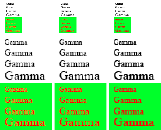
Gradients
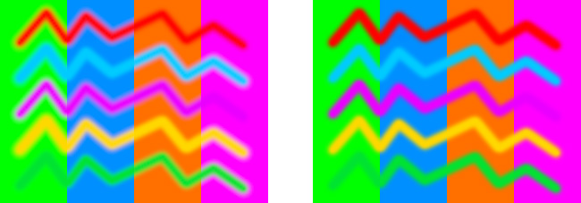
The image below shows the difference between gradients calculated in linear (top gradient) and sRGB space (bottom gradient). Note how direct interpolation on the sRGB values yields much darker and sometimes more saturated looking images.
Just going by the looks, one might prefer the look of the sRGB-space versions, especially for the last two. However, that’s not how light would behave in the real world (imagine two coloured light sources illuminating a white wall; the colours would mix as in the linear-space case).
Almost everybody does this the wrong way: CSS gradients and transitions are wrong (see this thread for details), Photoshop is wrong (as of version CS6) and there’s not even an option to fix it.
Two drawing programs that got this (and gamma-correctness in general) right are Krita and Pixelmator. SVG also let’s the user to specify whether to use linear or sRGB-space interpolations for gradients, compositing and animations.
Colour blending
Drawing with soft brushes in gamma-incorrect drawing programs can result in weird darkish transition bands with certain vivid colour combinations. This is really a variation of the gradient problem if you think about it (the transition band of a soft brush is nothing else than a small gradient).
Some random people claimed on the Adobe forums that by doing this Photoshop is really mimicking how mixing paints would work in real life. Well, no, it has nothing to do with that. It’s just the result of naive programming to work directly on the sRGB pixel data and now we’re stuck with that as the default legacy behaviour.
Alpha blending / compositing
As another variation on colour blending, let’s see how alpha blending holds up. We’ll examine some coloured rectangles first. As expected, the gamma-correct image on the left mimics how light would behave in real life, while the sRGB space blending on the right exhibits some weird hue and brightness shifts.
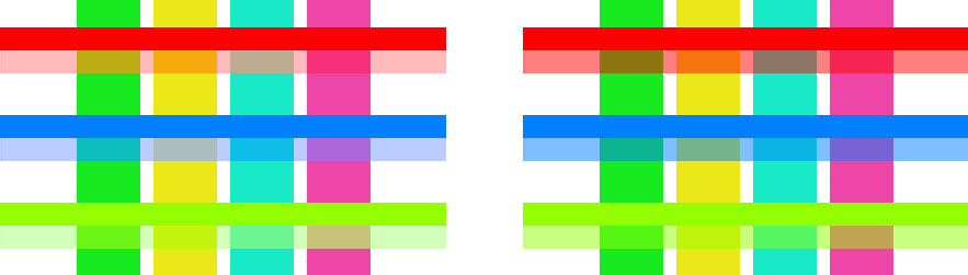
The appearance of false colours is also noticeable when blending two photos together. On the gamma-correct image on the left, the skin tones and the reds and yellows are preserved but faded into the bluish image in a natural way, while on the right image there’s a noticeable overall greenish cast. Again, this might be an effect you like, but it’s not how accurate alpha compositing should work.

Image resizing
These examples will only work if your browser doesn’t do any rescaling on the images below. Also, note that screens of mobile devices are more inaccurate with regards to gamma than regular monitors, so for best results try to view this on a desktop computer.
The image below contains a simple black and white checkerboard pixel pattern (100% zoom on the left, 400% zoom on the right). The black pixels are RGB(0,0,0), the minimum light intensity your monitor is capable of producing, and the white ones RGB(255,255,255), which is the maximum intensity. Now, if you squint a little, your eyes will blur (average) the light coming from the image, so you will see a grey that’s halfway in intensity between absolute black and white (therefore it’s referred to as 50% grey).
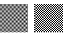
From this follows that if we resized the image by 50%, a similar averaging process should happen, but now algorithmically on the pixel data. We expect to get a solid rectangle filled with the same 50% grey that we saw when we squinted.
Let’s try it out! On the image below, A is the checkerboard pattern, B the result of resizing the pattern by 50% directly in sRGB-space (using bicubic interpolation), and C the resizing it in linear space, then converted to sRGB.
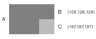
Unsurprisingly, C gives the correct result, but the shade of grey might not be an exact match for the blurred checkerboard pattern on your monitor if it’s not properly gamma-calibrated. Even the math shows this clearly: a 50% grey pixel that emits half as much light as a white pixel should have a RGB value of around (186,186,186), gamma-encoded:
$$0.5^{1/2.2} ≈ 0.72974$$ $$0.72974·255 = 186$$
(Don’t worry that on the image the 50% grey is RGB(187,187,187). That small difference is because the image is sRGB-encoded, but I used the much simpler gamma formula for my calculation here.)
Gamma-incorrect resizing can also result in weird hue shifts on some images. For more details, read Eric Brasseur’s excellent article on the matter.
Antialiasing
I guess it’s no surprise at this point that antialiasing is no exception when it comes to gamma-correctness. Antialiasing in γ=2.2 space results in overly dark “smoothing pixels” (right image); the text appears too heavy, almost as if it was bold. Running the algorithm in linear space produces much better results (left image), although in this case the font looks a bit too thin. Interestingly, Photoshop antialiases text using γ=1.42 by default, and this indeed seems to yield the best looking results (middle image). The reason for this is that most fonts have been designed for gamma-incorrect font rasterizers, hence if you use linear space (correctly), then the fonts will look thinner than they should.
Physically-based rendering
If there’s a single area where gamma-correctness is an absolute must, that’s physically-based rendering (PBR). To obtain realistic looking results, gamma should be handled correctly throughout the whole graphics pipeline. There’s so many ways to screw this up, but these are the two most common ways:
- Doing the calculations in linear space but failing to convert the final image to sRGB and then “tweaking” various material and lighting parameters to compensate.
- Failing to convert sRGB texture images to linear space (or set the sRGB flag when hardware acceleration is used).
These two basic errors are then usually combined in various interesting ways, but the end result would invariably fail to resemble a realistic looking scene (e.g. quadratic light falloff will not appear quadratic anymore, highlights will be overblown and will exhibit some weird hue and saturation shifts etc.)
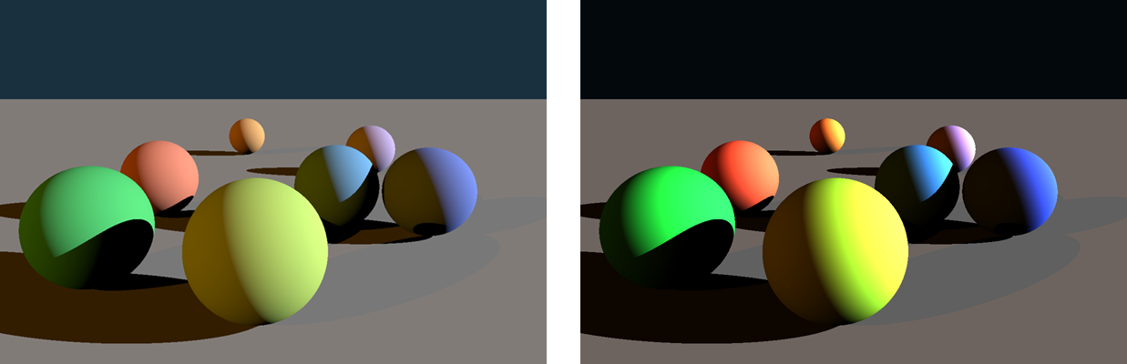
To demonstrate the first mistake using my own ray tracer, the left image below shows a very simple but otherwise quite natural looking image in terms of physical lighting accuracy. This rendering took place in linear space and then the contents of the framebuffer were converted to sRGB before writing it to disk.
On the right image, however, this last conversion step was omitted and I tried to tweak the light intensities in an attempt to match the overall brightness of the gamma-correct image. Well, it’s quite apparent that this is not going to work. Everything appears too contrasty and oversaturated, so we’d probably need to desaturate all material colours a bit maybe use some more fill lights to come closer to the look of the left image. But this is a losing battle; no amount of tweaking will make the image correct in the physical sense, and even if we got it to an acceptable level for one particular scene with a particular lighting setup, any further changes to the scene would potentially necessitate another round of tweaks to make the result look realistic again. Even more importantly, the material and lighting parameters we would need to choose would be completely devoid of any physical meaning whatsoever; they’ll be just a random set of numbers that happen to produce an OK looking image for that particular scene, and thus not transferable to other scenes or lighting conditions. It’s a lot of wasted energy to work like that.
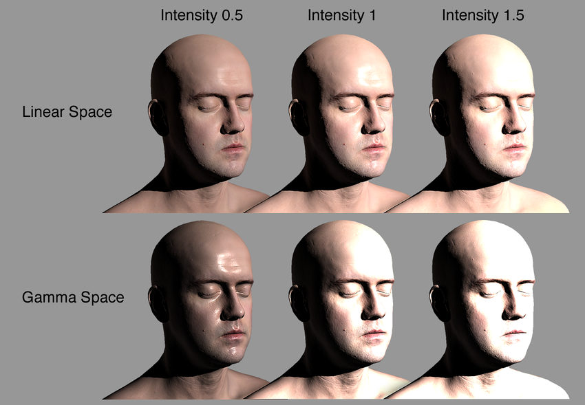
It’s also important to point out that incorrect gamma handling in 3D rendering is one of the main culprits behind the “fake plasticky CGI look” in some (mostly older) games. As illustrated on the image below, rendering realistic looking human skin is almost impossible with a gamma-incorrect workflow; the highlights will just never look right. This gave birth to questionable practices such as compensating for the wrong highlights in the specular maps with inverted hues and all sorts of other nastiness instead of fixing the problem right at the source…
Conclusion
This is pretty much all there is to gamma encoding and decoding. Congratulations for making it so far, now you’re an officially certified gamma-compliant developer! :)
To recap, the only reason to use gamma encoding for digital images is because it allows us to store images more efficiently on a limited bit-length. It takes advantage of a characteristic of human vision that we perceive brightness in a logarithmic way. Most image processing algorithms expect pixel data with linearly encoded light intensities, therefore gamma-encoded images need to be gamma-decoded (converted to linear space) first before we can run these algorithms on them. Often the results need to be converted back to gamma-space to store them on disk or to display them on graphics hardware that expects gamma-encoded values (most consumer-level graphics hardware fall into this category). The de-facto standard sRGB colourspace uses a gamma of approximately 2.2. That’s the default colourspace for images on the Internet and for most monitors, scanners and printers. When in doubt, just use sRGB.
From the end-user perspective, keep in mind that most applications and software libraries do not handle gamma correctly, therefore always make sure to do extensive testing before adopting them into your workflow. For a proper linear workflow, all software used in the chain has to be 100% gamma-correct.
And if you’re a developer working on graphics software, please make sure you’re doing the correct thing. Be gamma-correct and always explicitly state your assumptions about the input and output colour spaces in the software’s documentation.
May all your lights be linear! :)
References & further reading
General gamma/sRGB info
Linear lighting & workflow (LWF)
In the Games of Madness – Tech Feature: Linear-space lighting
Larry Gritz, GPU Gems 3 – Chapter 24. The Importance of Being Linear
Jeremy Birn – Top Ten Tips for More Convincing Lighting and Rendering – (Section 1. Use a Linear Workflow)
Bill Spitzak – High-speed Conversion of Floating Point Images to 8-bit
Eric McClure – The Great Mystery of Linear Gradient Lighting
Bonus stuff
Only if your operating system is Mac OS X 10.6 or higher or Linux. ↩︎
Comments
comments powered by Disqus